Con Carlyon inspired this post today. He’s kept an eye on the best browser and forwarded me a test from TechCrunch where Firefox, Chrome, IE9 and Opera 11 are pitted against one another. The victors are Firefox and Chrome.
My needs are quite different from most people. For starters, the number-one criterion for me on any browser is decent typography. Firefox has been, at least since v. 3, the most typographically aware browser, picking up the correct typefaces from stylesheets, and providing access to all installed fonts on a system through its menu.
I had done these tests before, but I thought it was about time I revisited the main four browsers and their typographic capability. These were all done on the same machine, and the full screen shots are available if anyone wants to see them. Firefox and IE9 were already on my system but were checked to be current and up to date. Chrome and Opera were downloaded today (February 23, 2012).
This is not a test about Java or overall speed, just typography. But I would have to give the speed crown to Chrome—bearing in mind that my Firefox is full of extensions and add-ons.
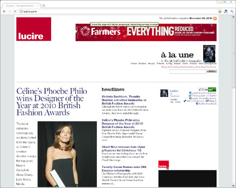
The Lucire home page
Not the latest HTML, but there is a fairly standard stylesheet. Here is how the four browsers performed.
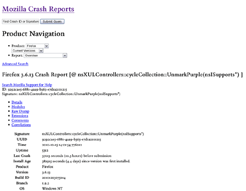
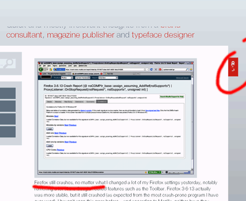
Firefox 10.0.2

I am used to this, so I don’t see anything unusual. Firefox is my browser of choice (though I have since tried Waterfox 64-bit, and noticed no speed difference). It picks up the web font (Fiduci, in the headline), kerns (see We in Week) and the text font, Dante, is installed on this machine. It’s the first type family specified in the stylesheet.
Kerning: 1. Font fidelity: 1.
Chrome

Not much difference on the left-hand side. However, Chrome fails to pick up Dante, even though it’s installed. It’s opted for Monotype Garamond for the body text. It’s the eighth typeface family specified in the stylesheet—an unusual choice. At least two of the other typeface families preceding Garamond are installed on this machine.
Kerning: 1. Font fidelity: 0.
Microsoft Internet Explorer 9

Awful. IE9’s bugs have already been documented on this blog, and it is very limited on which fonts it allows you to access in its menu (TTFs only). There is no kerning, and Monotype Garamond, again, has been chosen as the text font. There were some even less attractive choices on the home page that I didn’t take a screen shot of.
Kerning: 0. Font fidelity: 0.
Opera 11.63

Interestingly, Fiduci is picked up for the headlines and Dante for the text. But a bug that Firefox had back in v. 2 in 2006, and which I filed with the makers of Opera in 2010, remains present. Opera fails to display characters above ASCII 128 properly, and when it hits a ligature, it will change the following characters to a different typeface, in this case, Times. No kerning, either.
Kerning: 0. Font fidelity: 0·5.
A Lucire news page
Much the same comments apply from the above, but it gave me confirmation of each browser’s issues.
Firefox 10.0.2

The first choices in each CSS spec are picked up.
Chrome

Instead of the Lucire typeface in the central column, Chrome specifies Verdana, the sixth typeface family for the spec.
Microsoft Internet Explorer 9

Same as Chrome, except without the kerning.
Opera 11.63

Correct typefaces, but for the changing fonts in the middle of the line.
Conclusion
If I really didn’t care about type—and most people don’t—I would have a hard time choosing between Chrome and Firefox. On this test alone, Chrome was the fastest—but I suspect a Firefox without add-ons would be comparable. But once you factor in type, Chrome makes some very odd decisions, as does IE9, about which fonts it chooses from the installed base. It doesn’t, consistently, pick the first one—and previous versions did.
Interestingly, Chrome now displays Facebook in Verdana. When I first encountered it, it displayed Facebook in our in-house Lucire 1, which we had programmed to substitute for Arial on our older machines.
So somewhere along the line, someone changed the way Chrome picked fonts, but having something installed is no longer a guarantee it will even show up on Google’s browser. That can’t be good for corporate environments where companies have paid a site- or company-wide licence to have the correct fonts installed. But I’m glad Chrome now uses the kerning pair data in fonts, and that’s made a positive difference to legibility.
IE9 is simply terrible. It made the same wrong calls as Chrome, but, to make things worse, it won’t even use the kerning data. Of the four tested, it comes dead last.
Opera is not far ahead, mind, at least based on the arbitrary point scale I assigned above. While it picks up the correct typefaces, some might think its irritating habit of changing fonts mid-line to be more annoying. It could well be, as this does nothing for reading. Imagine every quotation mark and every word with a ligature changing—for no apparent reason. As mentioned, this bug was in Firefox in 2006, and Opera knows about it, but evidently Opera users are not displeased with the glitch and it remains unfixed.
Typographically, Firefox 10.0.2 is the victor—and that’s no surprise. When I discovered bugs in Firefox 4, I was met with professional developers on the forums who actually understood type and the niceties behind the OpenType spec. Those are details some professional typeface designers don’t know. It looks I won’t be changing browsers any time soon.
You may also like


I find this interesting if only to illustrate that users have many complaints with Internet Explorer– and Microsoft doesn’t seem to regard them. The most common complaint, of course, is its quixotic web standards that drive programmers and designers alike crazy. Yet Microsoft is trying hard to get a toehold in the tablet market. If Apple and the iPad is setting the standard (that tablets will be consumer devices, primarily), and there is continued development for periodical publishers to provide more magazine-like digital media, I think typography will be more scrutinized in the future. So I think you’ve got legitimate concerns, Jack.
I think I’ve said this before; Chrome is the darling of the tech world mostly because it does take the speed crown. Although I’m not sure what Chrome’s relation to Google Chrome OS and Android is, what I said above about typography may well apply to Google. It will probably apply more to Android, since it seems to be better established in mobile computing presently. Hard to say. Android’s basis in Linux is well understood; I think most users at least know Android is easy to tweak even if they don’t know the connection, directly. This could make typography much more important to tweakers and hackers, but I don’t know if the more casual user will deem it important. More on point– it’s harder to say devices using Android have a consumerist focus, and magazine-like media may have less of a presence.
With the increase in typographic awareness in the last 20 years, I believe browser makers will need to get this right. The Android stuff I have seen is great and the rendering is beautiful, better than what I have seen on the desktop. So someone out there is paying attention.
I was very disappointed with Chrome though, regardless of my bias against Google. Firefox does seem to be the best when it comes to Windows browsers though, and I suspect the same would apply to Macs, too.
I’m trying to remember what Ex-Vox Mac users said. I think most did go with Firefox.
On Linux, as I implied, it’s very much a divide. Some really do favor pure speed, and go with Chrome. I think Firefox has the best balance of performance, productivity, and displays right now, although I will note there was much griping about Mozilla apeing Google Chrome in design (particularly elimination/minimizing of navigation buttons).
On Chrome switching to use the same (bad) font choices as IE9: it’s entirely possible this was a deliberate act of “doing the same as IE”, which browsers sometimes feel pressured to do, in order to be “compatible” with some sites where anything but “the same as IE” is borked.
Hard to be sure, of course, without asking Chrome; but it’s possible this is a work-around for bad sites that assume IE (still).
I think IE10 is the better but is impossible keep chrome beside