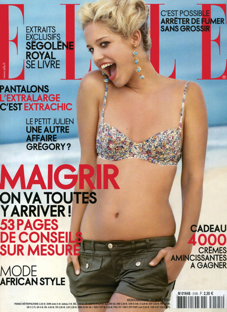
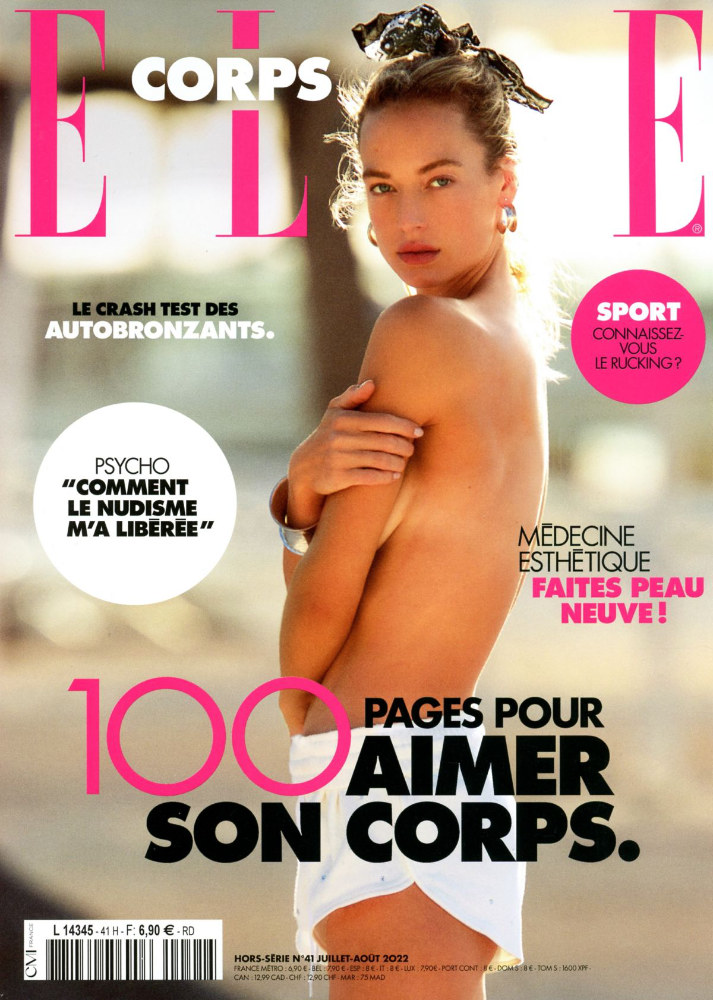
Here are three Elle covers that I uploaded to last month’s gallery, from 1991, 2007 and 2022. Which looks the most modern?
To me, it’s the 1991 US one. The Futura Light type is calm, it all looks rather balanced, and the photograph is well lit and composed. From memory, it was commended by the Society of Publication Designers in New York but I have to check my old annuals.
Go to 2007 and there’s just too much clutter, and the custom type looks uncomfortable, especially the bolder cut. The 2022 cover sits somewhere in between, but it feels like it’s the dawn of desktop publishing with different sizes and weights, and type inside circles.
Granted, I’m not comparing apples with apples, as the 21st-century covers are for the French market, and the 2022 cover isn’t strictly for Elle but the Elle Corps summer special. Makes you wonder what timelessness is, and if such a thing even exists. Many of the old covers for Lucire that I art-directed were meant to be timeless, too, but how they have dated! Is it about calm, a lack of clutter, and a sensible, restrained use of type? Or does that in fact date things, and we’re just at a moment in time when the 1991 cover’s trends have come round again?
You may also like