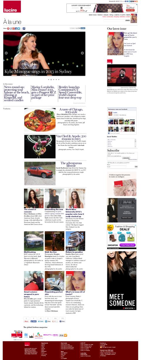
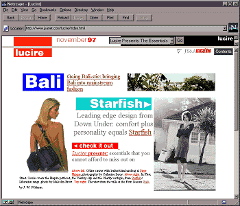
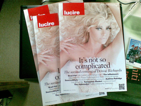
When Lilith-Fynn Herrmann, Tania Naidu, Julia Chu, Tanya Sooksombatisatian and I redesigned Lucire in 2012, we went for a very clean look, taking a leaf from Miguel Kirjon’s work at Twinpalms Lucire in Thailand. I’m really proud of the results, and it makes you happy to work on the magazine—and just pick up the finished article and gaze at it.
But the website—where it all began 15 years ago—was looking a bit dreary. After getting Autocade to 2,000 models, and updating various listings to reflect the 2013 model year, it was time we turned our attention to Lucire.
Like all of these things, the mood has to hit you right, and we needed a quiet news day—of which there are plenty at this time of the year. We knew where things were with the web: because of improved screen resolutions, type had to be larger. There may be—and this is something we don’t have any research on yet—people who are familiar with on-screen reading that some of the rules about line length might apply less. And some of the successful publications have multiple sharing—in fact, there are so many links to like or Tweet or pin something on each page that you can be left wondering just which one you press.
The last big overhaul of the Lucire look online was in 2009, and the updates have been relatively minor since then. But it was looking messy. We had to add icons for new things that were creeping up. One Facebook “like” button wasn’t enough: what about people who wanted to become Facebook fans? Surely we should capture them? Maybe we should put up a Pinterest link? That went up during 2012. We had 160-pixel-wide ads for years—so we kept them. The result was tolerable, and it served us reasonably well, but did people still browse Lucire for fun? Or was it just a site where you got the information you needed and left again? Bounce rates suggested the latter.
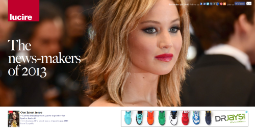
While some of these things were noted subconsciously, we didn’t have a firm brief initially. We simply decided to do one page with a new look, to see how it would go. We had the print editions in mind. We knew we wanted clean—but we still had to eat, so advertising still had to take up some of the page. We also knew that the lead image should be 640 pixels wide, and that that would have to be reflected on the news pages.
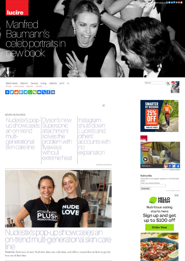
I’m glad to say we got lucky. The first page done—a redesign of Sarah MacKenzie’s BMW X1 first drive, which originally went up with the old look on January 1—worked. It had all the features we wanted, even if it meant abandoning some things we had had for a long time, such as the skyscraper ads. The callouts could go. In fact, we could remove the central column altogether. And the ‘Related articles’ could be moved to the bottom, where they used to be. And we stuck up plenty of sharing tools, even if good design says they introduce clutter, so we could capture users at the start and the end of an article—but we used different templates for each one. All the social networking pages we had could go to the top of the page in a row with ‘Follow us’.
The trick was then to repeat the look on other pages.
The ‘Volante’ index page is the only one so far to be brought into line with the new template, just to try some different layouts. I don’t think it’s quite there yet, though fashion ed. Sopheak Seng believes it’s clean enough. Practically, it is where it should be, but I want some visual drama in there. We’ll see—I think Sopheak might be right given the function of the index page, and it is heaps cleaner than how it used to look.
The home page, of course, is the biggie, and I’m very proud to note that there’s been some great DIY there. While the slider and Tweets appear courtesy of programming that its authors have distributed freely, it’s a nice feeling to be able to say that they are on there because of in-house work, using Jquery (which we last used internally at JY&A Consulting’s website), and not a convenient WordPress plug-in. Time will tell whether it will prove to be more practical to manage but I think it already is.
I’ve summarized in Lucire some of the features, but there were just sensible things like getting rid of the QR code (what’s it doing on the website, anyway?), the Digg link (yes, really), the Nokia Ovi link (not far from now, kids will be asking what Nokia was). We have removed three of the six news headlines and grouped the remaining ones in a more prominent fashion—which might mean people will need to scroll down to see them, so I can foresee them being moved up somehow. But, overall, the effect is, as Sopheak notes, so much closer to the print title.
The slider has solved some problems with Google News picking up the wrong headline, too. I realize the big omission is not doing a proper mobile-optimized version but we need to do a bit more learning internally to deliver that properly. The news pages, which are on Wordpress, have the default Jetpack skin. We have made some concessions to mobile devices and Sopheak tells me it is more browseable on his Samsung.
And today, the look went on to all the news pages.
I mentioned to him today that it was very 2002–3. That period, too, saw Lucire get a redesign, standardizing things, making the pages cleaner, and in line with a print style (although at that point, the print edition had not been launched—though when it did, we adapted some of the look from the site). That look lasted us into 2006, perhaps longer than it should have been, given that we had some internal issues in that period.
It’s only natural that some clutter will be reintroduced as the years wear on—in Facebook’s case, it only takes a few months—but, for now, we’re hoping that bounce rate goes down, that the team, as a whole, feel far prouder of the work that appears online where it’s seen by more people, and that we have future-proofed a little.
So what were the lessons? (a) You need to keep on top of developments, and, even if you’re not the richest company in the world, you need to have someone thinking about how you look to the public. If smaller companies can manage teams more effectively, then they need to ensure there’s strong loyalty—and that the feedback about things like the website are collated, either online or kept with one team member who champions the change. When a redesign happens, you’ll need to solve a lot of problems in one go. (b) There is no substitute for doing—and even getting it wrong on occasion. What we’ve done is to phase things in—just so we can learn from any bugs. (c) And after the job is done, take some time to enjoy it.
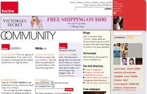
There’s probably no surprise when I say that this site is next. I know, it has links to different blog readers. It looks very mid-2000s. Which is no surprise, considering when it was designed …
