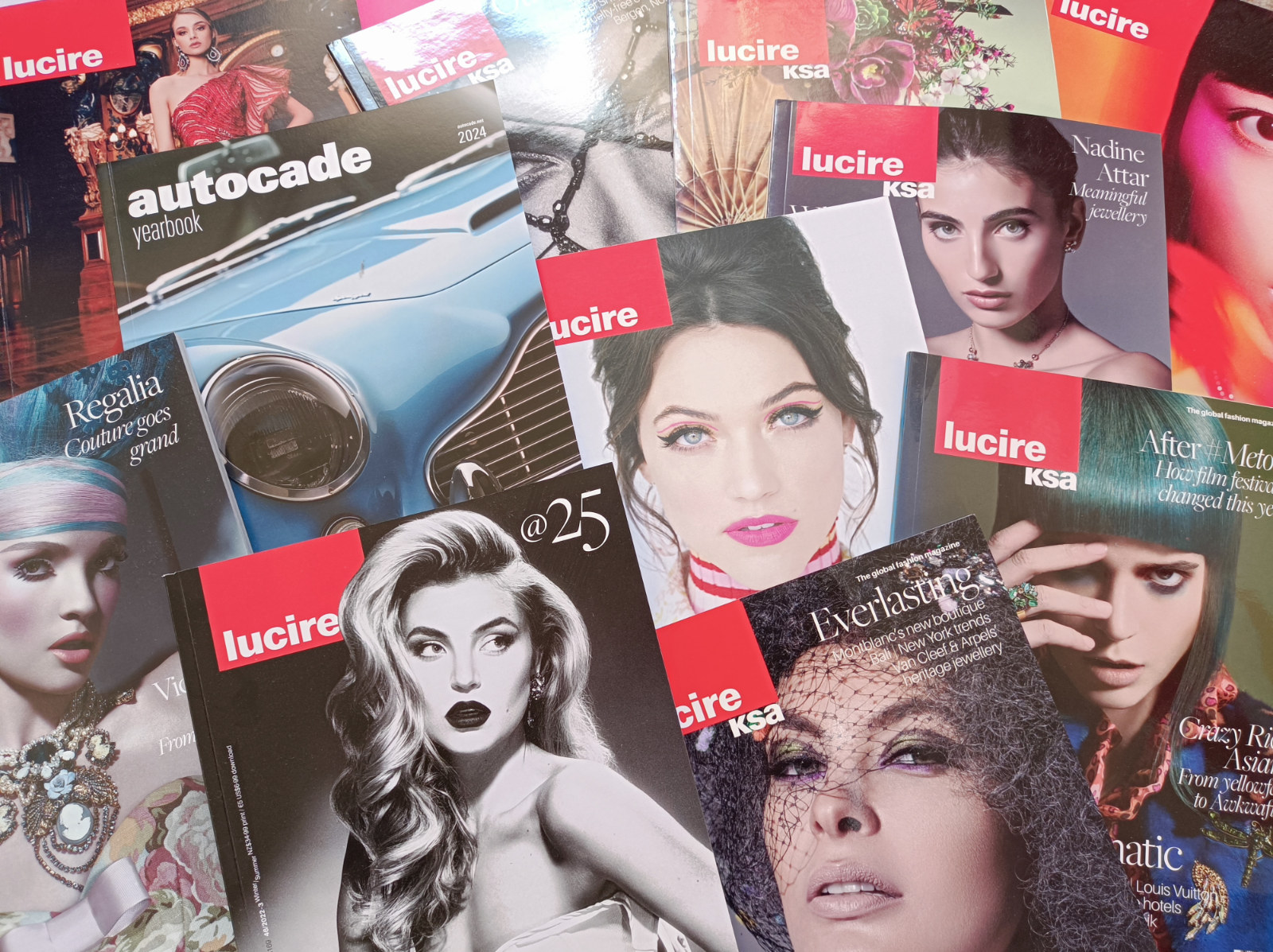
Share this page
Quick links
Add feed
|
|
The Persuader
My personal blog, started in 2006. No paid or guest posts, no link sales.
Posts tagged ‘design’
12.03.2023
This is one of the more fascinating type design stories I’ve come across in ages. Jens Kutilek has revived a very unlikely typeface: the IBM Selectric version of Univers in 11 pt.

A lot of us will have seen things set on a Selectric in the 1970s, especially in New Zealand. I’ve even seen professional advertisements set on a Selectric here. And because of all that exposure, it was pretty obvious to those of us with an interest in type that all the glyphs were designed to set widths regardless of family, and the only one that looked vaguely right was the Selectric version of Times.
Jens goes into a lot more detail but, sure enough, my hunch (from the 1980s and 1990s) was right: Times was indeed the starting-point, and the engineers refused to budge even when Adrian Frutiger worked out average widths and presented them.
It’s why this version of Univers, or Selectric UN, was so compromised.
What I didn’t know was that Frutiger was indeed hired for the gig, to adapt his designs to the machine. I had always believed, because of the compromised design, that IBM did it themselves or contracted it to a specialist, but not the man himself.
There’s plenty of maths involved, but the sort I actually would enjoy (having done one job many years ago to have numerous type families meet the New Zealand Standard for signage, and having to purposefully botch the original, superior kerning pairs in order to achieve it).
I think I kept our IBM golfballs, which carried the type designs on them, and hopefully one day they’ll resurface as they’re a great, nostalgic souvenir of these times.
What is really bizarre reading Jens’s recollection of his digital revival is that it’s set in Selectric UN 11 Medium (an excerpt is shown above). Here is type that was set on to paper, now re-created faithfully, with all of its compromises, for the screen. He’s done an amazing job and it was like reading a schoolbook from the 1970s (but with far more interesting subject-matter). Those Selectric types might not have been the best around, but the typographic world is richer for having them revived.
The hits per post here have fallen off a cliff. I imagine we can blame Google. Seven hundred was a typical average, but now I’m looking at dozens. I thought they’d be happy with my obsession over Bing being so crappy during 2022, but then, if they’re following Bing and not innovating, maybe they weren’t. Or that post about their advertising business being a negligence lawsuit waiting to happen (which, incidentally, was one of the most hit pieces over the last few months) might not have gone down well—it was a month after that when the incoming hits to this blog dropped like a stone. Maybe that confirms the veracity of my post.
I’m not terribly surprised. And before you think, ‘Why would Google care?’, ‘Would they bother targeting you?’ or ‘You are so paranoid,’ remember that Google suspended Vivaldi’s advertising account after its CEO criticized them, and in the days of Google Plus, they censored posts that I made that were critical of them. Are they after me? No, but you can bet there are algorithms that work to minimize or censor sites that expose Google’s misbehaviour, regardless of who makes the allegations, just as posts were censored on Google Plus.
Tags: 1960s, 1970s, 2022, 2023, Adrian Frutiger, censorship, design, fonts, Google, IBM, technology, typeface design, typefaces, typography Posted in design, interests, internet, New Zealand, technology, typography, UK | No Comments »
06.03.2023
Paris Marx makes a very good case about Elon Musk wanting to relive the good ol’ days when he was doing start-ups at the beginning of the millennium. It’s why things at Twitter are as bad as they are: Musk’s nostalgia. It’s well worth a read if you’re interested in what’s going on at OnlyKlans, as Marx probably nails it far better than a lot of other commentators.
There were aspects of the good old days I liked, too. Better CPM rates for online ads. Way more creativity in web design, as well as experimentation. The fact I could balance doing brand consulting, typeface design, and publishing. That helped my creativity flow. But these are rose-coloured glasses; there’s plenty about my current life that is far better than those hairy start-up days.
If there’s one thing I’ve learned in half a century on earth is that you can’t re-create the past. And even if you could, it wouldn’t be as good as how you remembered it.
I’m often nostalgic for those early days in Hong Kong and that mega-fantastic day of the Tung Wan Hospital fair in 1975 (or was it ’76?), where I got to go in the bucket of a Simon Snorkel fire engine. Wonderful day. But at the time I couldn’t drive (I was three), so you can’t have it all.
And millennium me running Lucire might have been having fun in terms of breaking new ground, but I’d much rather be where I am now having talked to Rachel Hunter and putting her on the home page (and in two print editions). Our stories are also heaps better than what they were in the late 1990s.

Just enjoy the moment and make the most of where you are at. I’ve projects I want to return to, too, but if I do, I won’t be assuming the year is 2000 and working in an area I don’t know that much about, while annoying all the people around me.
Tags: 1970s, 1975, 1976, 1990s, 2000, 2023, celebrity, design, Elon Musk, Hong Kong, Lucire, nostalgia, publishing, Twitter, web design Posted in business, design, Hong Kong, internet, New Zealand, publishing, technology, USA, Wellington | No Comments »
01.03.2023

I have told this story many times: I became interested in fashion magazines with a 1989 issue of Studio Collections. In fact, it was its fifth anniversary issue. I really liked the typesetting, photography and print quality. I was probably one of the few people disappointed when they went to desktop publishing and the typesetting quality deteriorated in the 1990s.
No such problem at Brogue (well, British Vogue) in 1991, which was still put together the old way. Coincidentally, my first issue of this venerable title was also an anniversary one, namely its 75th. Linda, Christy and Cindy were known to everyone, even young straight boys like me (actually, especially young straight boys like me). Here the visuals and the article quality were influential, and I had grown up reading largely British car magazines, such as Car and Autocar (though I began with Temple Press’s Motor in 1978). The British way of writing resonated with me and it was familiar territory.
My journey in this world, therefore, began eight years before I started Lucire, and the ideas had brewed for some time.
Yesterday we uploaded three articles from 1998 and they were quite terrible. I might have known what the benchmark was from the late 1980s and early 1990s, but we sure didn’t hit it in our writing a year after we started. I like to hope that we have since got there.

Someone shared Phil Knight’s 10 steps in business for Nike, when it was a fledgling enterprise back in the 1970s. I had seen this a long time ago, in the late 1980s, and even used to share it with my students in 1999–2000. I hadn’t seen it since.
They are aggressive and macho, which probably ties quite well in with Nike and its early days (John McEnroe was more than a suitable ambassador). They probably lend themselves quite well to sportswear. But a few of these are universal in business.
I like (7): ‘Your job isn’t done until the job is done,’ and the third of the eight ‘Dangers’: ‘Energy takers vs. energy givers’. Bureaucracy, naturally, heads that list of dangers, and rightly so.
You should ‘Assume nothing’ (5).
I don’t know if they still follow these tenets, but some definitely remain relevant.
Tags: 1970s, 1980s, 1989, 1990s, 1991, 2023, business, design, fashion, fashion magazine, JY&A Media, Lucire, magazine design, magazines, modelling, Nike, publishing, retro, typography, UK, USA, Vogue Posted in business, culture, design, leadership, media, New Zealand, publishing, UK, USA | No Comments »
27.02.2023

I needed a 2023 wall planner today, but none of the downloadable ones really suited—so I made my own. Rather than keep it to myself, I thought I’d offer it as a free download, in case anyone else wants it. They’re two A4s, six months on each, but as the file’s a PDF, you can scale it to A3 without any loss in quality.
The PDF is here (89,747 bytes)—help yourself. And yes, I know it’s nearly March.
When I was around five going on six, I found great joy making little calendars. The Massimo Vignelli Stendig calendar was still very influential in the mid- to late 1970s, and many designers followed that lead. They fascinated me, and I got used to the patterns (how April and July start on the same weekday, as do September and December; in non-leap years, so do February and March, and January and October). I remember drawing (on A4s) calendars out from 1978 to 1980 to study these patterns. Of course, 1980 was a leap year, which threw up different patterns.
Ever the perfectionist, there was one month where I missed some days. Upon realizing my mistake, I became frustrated, and stopped. If I had Twink or Liquid Paper I might not have stopped!
When I had to design some calendars for work in the 2010s, the Stendig calendar still came to mind, but certain practical considerations meant I couldn’t ape it completely. Still, there was plenty of big Helvetica on it.
Tags: 1970s, 1978, 2023, calendar, childhood, design, graphic design, Helvetica, Massimo Vignelli, memory, modernism, office, typography Posted in business, design, typography, USA | No Comments »
01.01.2023
Here are January 2023’s images—aides-mémoires, photos of interest, and miscellaneous items. I append to this gallery through the month.
Notes
Rosa Clará image, added as I was archiving files from the third quarter of 2021.
The Claudia Schiffer Rolling Stone cover came to mind recently—I believe it was commended in 1991 by the Society of Publication Designers, which I was a member of.
I looked at a few more risqué, but mainstream, covers to see what is appropriate, since the Lucire issue 46 cover was one of our more revealing though most glamorous ones in years. Vanity Fair and Women’s Health were useful US cases.
Lucire 46 cover for our 25th anniversary: hotographed by Lindsay Adler, styled by Cannon, make-up by Joanne Gair, and hair by Linh Nguyen. Gown by the Danes; earrings by Erickson Beamon at Showroom Seven; and modelled by Rachel Hilbert.
Tags: 1961, 1970s, 1975, 1980s, 1989, 1990, 1990s, 2009, 2017, 2021, 2022, 2023, actress, advertisement, advertising, Australia, Bertone, BL, BMW, British Leyland, Cannon, car, cartography, celebrity, China, Condé Nast, Croatia, design, Elle, Ellen von Unwerth, fashion, film, Frankfurt, Germany, Giorgetto Giugiaro, Google, humour, Italy, Joanne Gair, JY&A Media, Lindsay Adler, Linh Nguyen, Lucire, magazine, magazine design, magazines, Mastodon, Mini, modelling, New York, Nissan, NY, photography, publishing, science, signage, Society of Publication Designers, Spain, supermodel, TV, UK, USA, Vogue Posted in China, design, gallery, humour, media, publishing, UK, USA | No Comments »
27.12.2022
Earlier in December, we decided to put a TV into our guest room. One catch: there is no aerial there, so initially we thought, ‘We have some great DVDs, let’s plug in the DVD player.’ But it didn’t quite feel right.
We’ve stayed at enough places with smart TVs, including some running the Android TV system. We’ve never really had a need to pursue this since most of the things I really love to watch have come out on DVD, and if Amanda and I wanted on-demand, there’s always the laptop with an HDMI cable. Simple.
I began looking into this and was intrigued by one suggestion on Mastodon for an Nvidia Shield, but alas, none were available in the time-frame (viz. before guests arrived). I was largely stuck with the Amazon Fire sticks, various Google-branded Chromecasts, and the DishTV Smartvu. The ever-knowledgeable Drew at PB Tech recommended the Smartvu, since he was in a similar boat: his place didn’t have an aerial, and he used the Smartvu to work as his regular TV. It also happened to be the most expensive of the lot.
My criteria were fairly basic. I wanted something that I could set up and sideload APKs on to, and never, ever go to a Google Play store. I began de-Googling in earnest at the end of 2009 and I sure as heck wasn’t going to intentionally invite the bastards back 13 years later—and actually pay to have their spyware in my home. The fact that Google’s offerings were more expensive than Amazon’s should be an affront to all consumers. Pay more to have them spy on you!
DishTV’s New Zealand distributor has comprehensive instructions on how to set it up, and sure enough, one of the first steps was it would take you to the Google Play store. No doubt that would be the same story with the Google Chromecasts. Which, unfortunately, left me with one choice: give Amazon money even though they owe me (and this is an ongoing dispute in which, since they are Big Tech, I believe they are lying).
But Amazon it was. PB was charging quite a lot more than Harvey Norman and Noël Leeming and, while Gerry Harvey might be a prized dick, he does seem to hire good people on the shop floor. I never had anyone at Leeming help. Nor could I even find the product at their Tory Street store.
Amazon does require an Amazon account, which I still have, despite all the BS; but once you are in, sideloading is not too difficult. And there’s no Google Play in sight, even if it is a reasonably stock Chromecast set-up.
Of course, I went through the privacy settings and made sure any data the gadget had collected to date were deleted.
I then proceeded to follow these instructions and enabled third-party apps.
The first method, sideloading from my phone using Apps2Fire, never worked. Waste of time. For whatever reason, the third method didn’t, either: ES File Explorer refused to sync with Dropbox despite all my credentials being correct. Of course I had to attempt the second one last—download the Downloader (yes, really), then go to the address where the APKs are.
It’s just as well, since some of the Amazon-hosted APKs don’t work (e.g. Euronews), so you need to find alternatives. Matt Huisman offers some New Zealand ones on his website, and getting the Freeview one was a no-brainer—the terrestrial channels are then all available, as though one had a normal TV. (I was very surprised to learn that this is not a common thing to do, and equally surprised that the APK was not available on Amazon; presumably it’s not on Google Play either.)

Amazon did suggest getting the Fire TV app for my phone, but when you scan the bar code, it offers two destinations from which to download it: Google Play and Apple Appstore (I still want to call it Ishop). This is pretty senseless, since Amazon has gone to the trouble of hosting so many APKs itself, why not its own one?
Maybe … it’s because it’s a lemon and doesn’t work. I grabbed the one at APK Mirror, and it was about as useless as a milliardaire running a social network. (I don’t believe it even installed.) No biggie, once everything was set up I had zero use for it.
Which leaves Alexa, which interested me from a technological point of view. The original Alexa will stop working on December 31, so I might as well shift to using the thing that Amazon now calls Alexa. And to ask it to make fart noises, which seems to be its only utility if you don’t have other gadgets wired into the network. Only problem: how does it work? Where do you talk into? The stick? The remote?
Strangely, Amazon does not say when I searched for information on its own site, so I guess everyone else automatically worked it out by telepathy.
All I know is when I pressed the button, as per the very few instructions provided in the box, the TV said to wait for the tone, then speak. Nothing ever happened, whether I spoke to the remote or to the stick.
One Mastodon user told me that I had to talk into the slot in the remote.
It was a week later that I tried keeping the button pressed down after the tone. Only then did it work.
I’m not sure how anyone is supposed to know that, especially as Amazon’s own instructions just instruct you to speak after the tone. There’s no instruction to keep the button pressed down. I would even say that implicitly, you’re instructed to let go of the button. You hear a strange noise, you release the button. That seems like a natural reaction to me.
Again we come to the usual conclusion that tech people make a lot of presumptions about how tech-savvy the public is. Folks, you need to assume that we are coming to these gadgets with zero knowledge about them. Yes, I realize Walter Matthau had to press the button on his mic to talk to Robert Shaw in The Taking of Pelham One Two Three, but Walt never had a computer tone beep back at him.
Now with hundreds of channels, there’s still barely anything to watch, though I did find the Jackie Chan movie Wheels on Meals in the original Cantonese. Once I finish watching that, it’s back to the DVDs for me. I just hope our guests are happy.
Tags: 2022, Amazon, Big Tech, design, Google, Google Android, Mastodon, privacy, retail, software, technology, TV, user interface Posted in design, interests, internet, New Zealand, technology, TV | No Comments »
11.10.2022
I’m not sure why I didn’t spot these back in 2012. This was very high praise from Cre8d Design, on ‘What is New Zealand’s iconic font?’ So nice to see JY Décennie in there.
Still on type, the fifth Congreso Internacional de TipografÃa in Valencia cites yours truly.
Como consecuencia de todos estos cambios, surgen numerosas cuestiones sobre cómo afrontar el uso y la creación de la tipografÃa en un nuevo contexto, sometido a constantes transformaciones tecnológicas. Para muchos, los modos tradicionales de concebir la tipografÃa ya no funcionan en el mundo de la pantalla. AsÃ, para el diseñador Jack Yan, la tecnologÃa está cambiando tan rápidamente que la idea de que la tipografÃa se crea para imprimir está llegando prácticamente a su fin. Los nuevos dispositivos electrónicos empiezan a demandar tipografÃas especÃficas y no sólo meras adaptaciones de las ya existentes. Esto implica igualmente un adiestramiento por parte del usuario final, el lector, que no sólo debe familiarizarse con los nuevos dispositivos sino con los nuevos procedimientos asociados a la lectura dinámica.
This is pretty mainstream thinking now (and I would have thought in 2012, too) but also nice to be credited for saying it—I guess I would have first publicly pushed this idea in Desktop in 1996. But designers like Matthew Carter and Vincent Connare were already there …
Amazing what you can find in a Mojeek ego search, as opposed to a Google one.
Tags: 2012, Aotearoa, design, Desktop, fonts, JY&A Fonts, Mojeek, New Zealand, Spain, technology, typeface design, typefaces, typography, Valencia Posted in design, New Zealand, publishing, technology, typography | No Comments »
16.09.2022
I see it was only 19 months ago since I bought the Asus ROG Strix Evolve mouse. A mouse that cost several times what a regular one does, claiming the switches would last 50 million clicks. It has now developed a fault, and I wouldn’t even consider myself a heavy user. I’m certainly not a gamer.
Mice seem to last shorter and shorter periods. An old Intellimouse 1.1 lasted from 2002 to 2013. Its successor (after trying badly made Logitechs) Microsoft mouse lasted from 2015 to 2020. Here is the latest lasting 19 months.
Its problem is that a single click is being recorded as two clicks, with increasing frequency. Right now, a very cheap no-name unit bought in August 2021 is the daily driver with my desktop PC, and one of the earlier ones will now have to go with my laptop. It’s reasonably comfortable because the size is (almost) right (the biggest criterion for me), it’s light, and it works. Those switches won’t last 50 million clicks and the unit feels cheaply made, but right now I need something usable, and most mice are just too small. I even saw an article testing mice for ‘large hands’, and I can tell you in no uncertain terms that they are for medium hands at best.
A Delux M625 is on its way now from Aliexpress (here’s the seller’s link). I’ve never heard of the brand before, but one Tweeter who responded to me says he has tried one, and found it acceptable. What sold it? None of the features that I find useless (a rapid fire button for gaming, RGB lighting effects that you never see because your hand is on the mouse and your eyes are on the screen, high DPI up to 24,000) but three simple figures: width, length, height.

The Microsoft Intellimouse 1.1, which I have raved about for decades, measures 126 by 68·1 by 39·3 mm. A bit of height helps so I don’t mind if a mouse exceeds 40 mm.
The Delux vendor claims 130·6 by 68·9 by 42·5 mm. That sounds very comfortable to me, as width is very important (something the Asus didn’t have, with my ring finger off the body of the mouse and on to the mouse pad). The no-name could be better, too. In a few weeks, I should know.
I had been so desperate after coming up empty with local sellers I even looked on Amazon. But I couldn’t be arsed converting Imperial measurements to metric, which the majority of the world uses. Jeff’s mob can carry on abusing workers and selling to their own country.
As to the Asus, caveat emptor: it hasn’t even lasted two years reliably.
Tags: 2020s, 2022, Aliexpress, Asus, China, computing, Delux, design, mouse, quality, quality control Posted in China, design, technology | 4 Comments »
02.08.2022


Here are three Elle covers that I uploaded to last month’s gallery, from 1991, 2007 and 2022. Which looks the most modern?
To me, it’s the 1991 US one. The Futura Light type is calm, it all looks rather balanced, and the photograph is well lit and composed. From memory, it was commended by the Society of Publication Designers in New York but I have to check my old annuals.
Go to 2007 and there’s just too much clutter, and the custom type looks uncomfortable, especially the bolder cut. The 2022 cover sits somewhere in between, but it feels like it’s the dawn of desktop publishing with different sizes and weights, and type inside circles.
Granted, I’m not comparing apples with apples, as the 21st-century covers are for the French market, and the 2022 cover isn’t strictly for Elle but the Elle Corps summer special. Makes you wonder what timelessness is, and if such a thing even exists. Many of the old covers for Lucire that I art-directed were meant to be timeless, too, but how they have dated! Is it about calm, a lack of clutter, and a sensible, restrained use of type? Or does that in fact date things, and we’re just at a moment in time when the 1991 cover’s trends have come round again?
Tags: 1991, 2007, 2022, design, Elle, France, graphic design, Hachette, layout, publishing, typography, USA Posted in design, France, media, publishing, typography, USA | No Comments »
01.06.2022
Of course I remember there was a holding page prior to Lucire launching on October 20, 1997 at 7 a.m. EST, or midnight NZDT on October 21, 1997. I just didn’t remember what it exactly looked like, till I discovered it at the Internet Archive:

There was no semicolon in JY&A Media, not even then; this must be some Internet Archive bug since I didn’t use & for the HTML entity in those days. Most browsers interpreted a lone ampersand correctly back then. We also tried to save bytes where we could, with the limited bandwidth we had to play with.
Pity the other captures from the 1990s aren’t as good, with the main images missing. I still have them offline, so one of these days …
Tags: 1990s, 1997, Aotearoa, design, history, Internet Archive, JY&A Media, Lucire, New Zealand, publishing, web design Posted in design, internet, media, New Zealand, publishing, technology, Wellington | 1 Comment »
|