There is something quite elegant about title typography from the turn of the decade as the 1960s become the 1970s.
There is 1971’s Diamonds Are Forever by Maurice Binder, which apparently is one of Steven Spielberg’s favourites, but I’m thinking of slightly humbler fare from the year before.
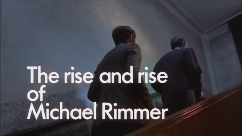
I got thinking about it when watching Kevin Billington’s The Rise and Rise of Michael Rimmer, which has Futura Demi tightly set (it is the 1970s) but arranged in an orderly, modernist fashion, aligned to the left on a grid. Nothing centred here; this is all about a sense of modernity as we entered a new decade.
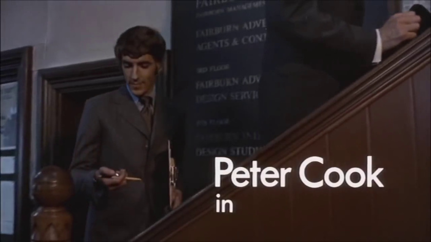
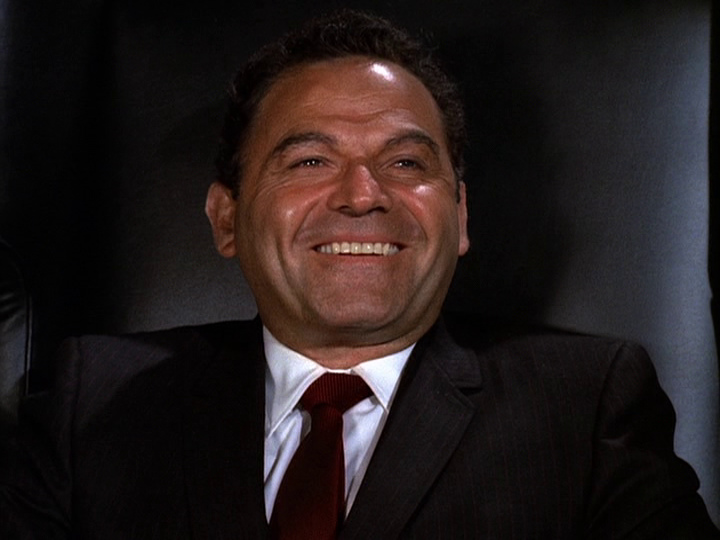
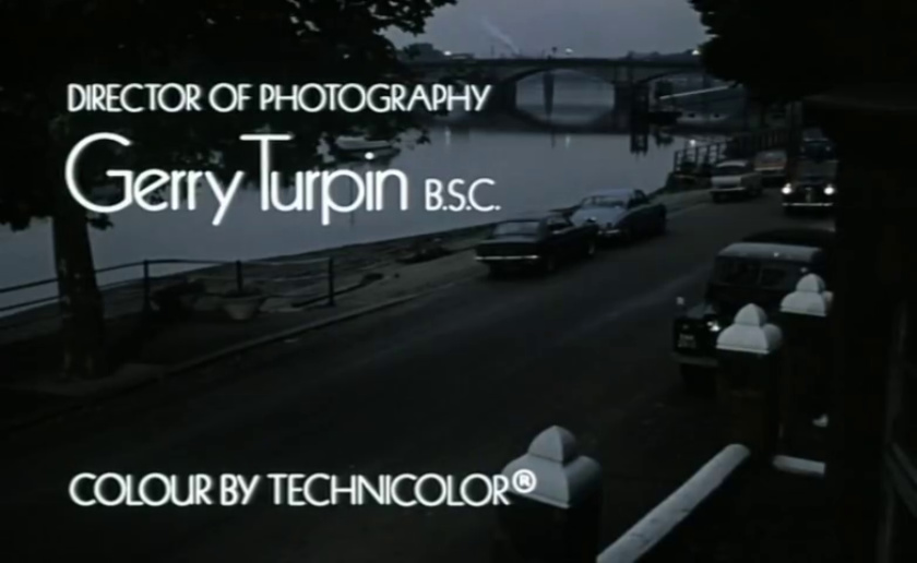
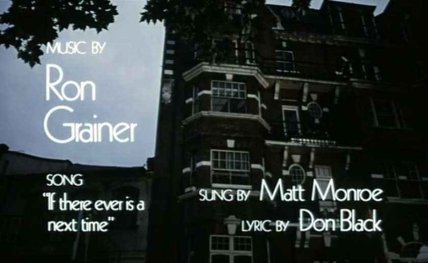
Similarly the opening title for Alvin Rakoff’s Hoffman, starring Peter Sellers and Sinéad Cusack. For the most part it’s Kabel Light on our screens, optically aligned either left or right. It’s a shame Matt Monro’s name is spelled wrong, but otherwise it’s nice to see type logically set with a consistent hierarchy and at a size that allows us to appreciate its forms. Monro belts out the lyrics to one of my favourite theme songs, ‘If There Ever Is a Next Time’, by Ron Grainer and Don Black, and the title design fits with them nicely.
It certainly didn’t stay like this—as the decade wore on I can’t think of type being so prominent in title design on the silver screen. Great title design is also something we seem to lack today in film. I helped out in a minor way on the titles for the documentary Rescued from Hell, also using Futura, though I don’t know how much was retained; given the chance it would be nice to revisit the large geometric type of 1970.
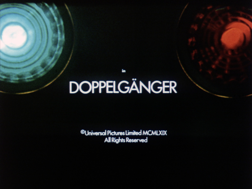
PS.: Another one to add, from 1969, for the Gerry Anderson fans out there: Doppelgänger. Used to good effect here.
You may also like