In the editorial to one of our print publications—not yet at liberty to say which—I show a 2004 cover of Lucire featuring Jennifer Siebel inset in the text. It got me thinking how, when I first designed the cover, with Jon Moe’s photograph, I was aiming for a classical timelessness. Now nearly 20 years on—in […]
Category: typography
Typeface design, typography and the font industry.
Sharper headlines for Lucire
We’ve made a tiny change to the look of the Lucire website, replacing Aileron Ultra Light in the headlines with Newsreader Display Light, namely the 72 pt cut. It always bothered me that Aileron didn’t have proper italics, only obliques. We could have licensed Freight Big Pro Light to match the print magazines, but […]
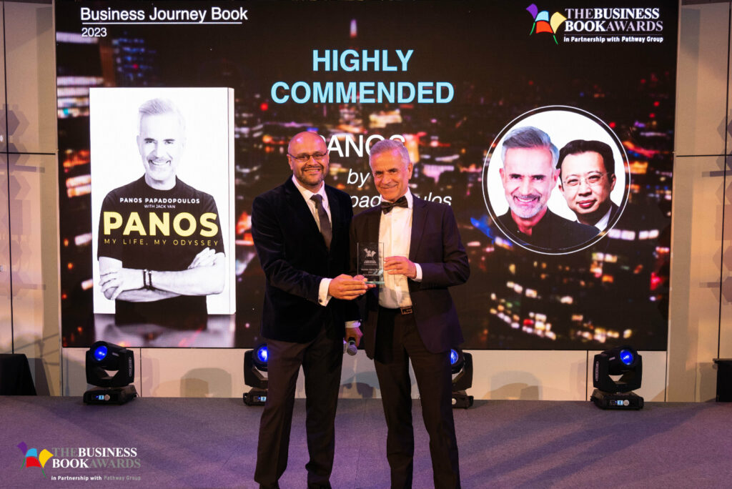
Panos: My Life, My Odyssey wins commendation at Business Book Awards 2023

I might not have made it to London for the Business Book Awards 2023, but my mug did, as Panos: My Life, My Odyssey won a Highly Commended in the Business Journey category. The organizers were kind enough to include me on the screen as Panos picked up the prize for his autobiography. It was […]
Read More… from Panos: My Life, My Odyssey wins commendation at Business Book Awards 2023
When you lose one parent early
This is about as personal as you’re going to ever read on this blog. It’s written for whomever needs to read it now. I felt I had to put it out there. You know who you are. When you lose your mum to cancer at 22, you feel a lot of emotions. Grief, for one. […]
These seem very fashionable right now
I keep saying that 2022 was a lot like 1973 stylistically, so now that it’s 1974 I find myself strangely compelled by these Audi 50 press shots. You might know this car better as the Volkswagen Polo, which it later became, though with a lower specification initially. It lasted longer than the original Audi. […]
It’s not just us: Google fares poorly for site: search for Quartz
Not all of you will have caught the postscript to yesterday’s post. I wanted to see if Google was doing as bad a job with other Wordpress-only websites, and one of the most famous is Quartz. Sure enough, it was. Of the top 50 for site:qz.com, 33 pages were author, tag or category pages (let’s […]
Read More… from It’s not just us: Google fares poorly for site: search for Quartz
The IBM Selectric version of Univers revived
This is one of the more fascinating type design stories I’ve come across in ages. Jens Kutilek has revived a very unlikely typeface: the IBM Selectric version of Univers in 11 pt. A lot of us will have seen things set on a Selectric in the 1970s, especially in New Zealand. I’ve even […]
Read More… from The IBM Selectric version of Univers revived
Of course Bing AI makes stuff up—Bing itself does
Of course some of us expected Microsoft Bing and ChatGPT to be rubbish—and we knew ChatGPT would make stuff up. Because Bing makes stuff up. If you have a normal, functioning web crawler (or spider), there’s no way you would ever wind up with pages that have never existed. Nothing about this is […]
Read More… from Of course Bing AI makes stuff up—Bing itself does
Free 2023 wall planner
I needed a 2023 wall planner today, but none of the downloadable ones really suited—so I made my own. Rather than keep it to myself, I thought I’d offer it as a free download, in case anyone else wants it. They’re two A4s, six months on each, but as the file’s a PDF, you […]
Tesla to a typeface designer, and a big missed target
Now that the quartet has been launched, it’s evident that Tesla’s naming strategy is all wrong. This is what they should be called. On a related note: Since I haven’t seen the March 15 video now circulating on OnlyKlans, I mean, Twitter, I can’t use the DIA reporting form. But those […]
Read More… from Tesla to a typeface designer, and a big missed target