This is one of the more fascinating type design stories I’ve come across in ages. Jens Kutilek has revived a very unlikely typeface: the IBM Selectric version of Univers in 11 pt.
A lot of us will have seen things set on a Selectric in the 1970s, especially in New Zealand. I’ve even seen professional advertisements set on a Selectric here. And because of all that exposure, it was pretty obvious to those of us with an interest in type that all the glyphs were designed to set widths regardless of family, and the only one that looked vaguely right was the Selectric version of Times.
Jens goes into a lot more detail but, sure enough, my hunch (from the 1980s and 1990s) was right: Times was indeed the starting-point, and the engineers refused to budge even when Adrian Frutiger worked out average widths and presented them.
It’s why this version of Univers, or Selectric UN, was so compromised.
What I didn’t know was that Frutiger was indeed hired for the gig, to adapt his designs to the machine. I had always believed, because of the compromised design, that IBM did it themselves or contracted it to a specialist, but not the man himself.
There’s plenty of maths involved, but the sort I actually would enjoy (having done one job many years ago to have numerous type families meet the New Zealand Standard for signage, and having to purposefully botch the original, superior kerning pairs in order to achieve it).
I think I kept our IBM golfballs, which carried the type designs on them, and hopefully one day they’ll resurface as they’re a great, nostalgic souvenir of these times.
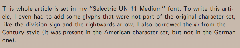
What is really bizarre reading Jens’s recollection of his digital revival is that it’s set in Selectric UN 11 Medium (an excerpt is shown above). Here is type that was set on to paper, now re-created faithfully, with all of its compromises, for the screen. He’s done an amazing job and it was like reading a schoolbook from the 1970s (but with far more interesting subject-matter). Those Selectric types might not have been the best around, but the typographic world is richer for having them revived.
The hits per post here have fallen off a cliff. I imagine we can blame Google. Seven hundred was a typical average, but now I’m looking at dozens. I thought they’d be happy with my obsession over Bing being so crappy during 2022, but then, if they’re following Bing and not innovating, maybe they weren’t. Or that post about their advertising business being a negligence lawsuit waiting to happen (which, incidentally, was one of the most hit pieces over the last few months) might not have gone down well—it was a month after that when the incoming hits to this blog dropped like a stone. Maybe that confirms the veracity of my post.
I’m not terribly surprised. And before you think, ‘Why would Google care?’, ‘Would they bother targeting you?’ or ‘You are so paranoid,’ remember that Google suspended Vivaldi’s advertising account after its CEO criticized them, and in the days of Google Plus, they censored posts that I made that were critical of them. Are they after me? No, but you can bet there are algorithms that work to minimize or censor sites that expose Google’s misbehaviour, regardless of who makes the allegations, just as posts were censored on Google Plus.
You may also like