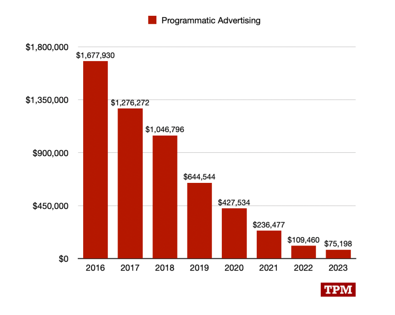
EB Garamond 12 on the Lucire website.
Not exactly earth-shattering news, but we’ve changed the body type on the Lucire website from Bembo to EB Garamond 12.
The cut of Bembo that we had didn’t feature macronized vowels—a big omission here in Aotearoa—though most recently it was a Latvian name, Elīna Arāja, which it failed to display properly. We liked Georg Mayr-Duffner’s revival of Garamond, based on the Berner specimen of 1592, but Mayr-Duffner never did heavier weights.
When we last facelifted the Lucire Men website (not one we promote heavily since it largely repeats relevant articles from the main one, but advertisers loved it), EB Garamond was chosen for the body type, and to complement it, we added bold and bold italic cuts from another family. Since we knew we could never match it, we purposefully chose one that fully contrasted EB Garamond. Cormorant Garamond was used for the headlines.
These are open-source typeface families, but Lucire Men is done on the cheap. (It had been doing well till Rupert Murdoch bought one of the agencies we dealt with, and Murdoch and digital don’t always play well.) But neither of those Garamond families looked cheap, and I always wanted to find a chance to use them elsewhere.
What prevented its adoption on the main Lucire site was the lack of heavier weights, and it was only by chance I discovered yesterday that Octavio Pardo added them in 2018 to the 12 pt cut, as part of a Google commission. In fact, some legitimate font sources still only have the original Mayr-Duffner collection.
With the main objection gone, we replaced Bembo, so that’s both headline and body types changed on the site this year. We had to increase EB Garamond’s pixel size by one in the CSS since it has a lower x-height than the Bembo we were using, even though that was also based on a 12 pt cut.
Pardo’s version of the regular and italic cuts use lining numerals by default, and I prefer oldstyle, so the Mayr-Duffner ones stay. Only the bold and bold italic are Pardo’s.
In print, we’ll likely stick with Matthew Carter’s ITC Galliard for the body type and Josh Darden’s Freight Big for the headlines since they both look great, and we have licences.
You may also like