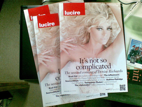
In the editorial to one of our print publications—not yet at liberty to say which—I show a 2004 cover of Lucire featuring Jennifer Siebel inset in the text. It got me thinking how, when I first designed the cover, with Jon Moe’s photograph, I was aiming for a classical timelessness. Now nearly 20 years on—in fact it was 20 years ago when I interviewed Jen and the cover followed soon afterwards—it’s not timeless at all. It can pass muster as a good design, but it wouldn’t have the impact in the modern market-place as the work once had. And that’s always the problem with design: timelessness is hard to achieve.

On the other hand, Demian Rosenblatt’s identity for Munro Shoes, on which Andrew J. Cross and I also worked, has stood the test of time, so much so that the client has continued to use it 20 years later. From what I recall, Demian wasn’t aiming for timelessness but achieved it; his desire was to capture the essence of the client, which he evidently has done.
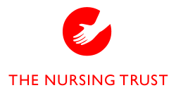
When I did the Nursing Trust’s rebrand a few years before, taking what was the Community Domiciliary Nursing Trust and renewing its visuals and its purpose, it was much the same philosophy. What resulted was right for the client regardless of what was trendy, and while the organization no longer exists, I look back at what I did and it still looks spot on.
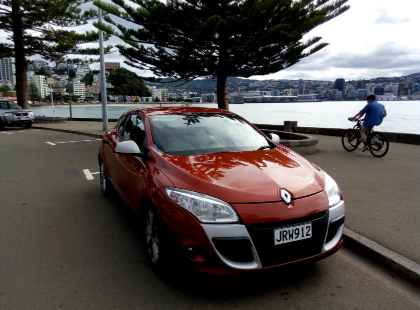
When you gather up things that have stood the test of time, you realize that when they were new, they weren’t exactly of their time. That rules out that 2004 Lucire cover, then. Look at cars: my Renault Mégane III coupé, for starters, a design by François Leboine under Fabio Filippini, which former Renault design head Patrick le Quément described as a ‘gob stopper’. It wasn’t there to please management, and it’s a pure expression of creativity, with its feature lines circling the car and giving the eye points of delight. It still looks good in 2023, even though the car was released in 2009.
Go back another generation and while the 1975 Jaguar XJ-S was initially reviled for not being a sporting car in the E-type mould (not that the E-type was that sporting by its end), it was also not of its time and wound up being increasingly admired as the 1980s wore on.
The same cannot be said of other British car designs of that period: the Leyland 18-22 series and the Triumph TR7, where the design teams became too obsessed with the wedge. The 1980 TVR Tasmin came at the tail end of this design theme, and if it were not for savvy upgrades that softened its shape, it would have wound up like disco did at the turn of that decade.
John Barry and Don Black’s ‘Diamonds Are Forever’ for the seventh Eon James Bond film might fall into the same category other than some instrumental choices; it stands in a class of its own separate from what else was happening in music, while it suited the brief for what was on the screen. The fact the song was sampled for Kanye West’s ‘Diamonds from Sierra Leone’ decades later attests to its strength.
Harry A’Court of Inject Design, who I have the privilege to say that I taught—or, to be fair, direct, since the talent was there from the day he walked into my class—has turned out graphic design jobs that are also timeless. Yet on analysis he pushes the envelope for every client and what emerges isn’t exactly of the time, either. It happens to be perfect for the client and to heck with current trends, has the impact that the client seeks and customers savour, and that winds up being timeless.
Look through the portfolio at Insight Creative and the same comments can be applied: the rebranding of the Sir Peter Blake Trust at the end of last decade resulted in Blake, officially in all caps, is perfect for the client, as is the collateral that went with it. It’s not “perfectly late 2010s” and transcends it. Similarly Insight’s work on the Cottage Lane Artisan Bakery rebrand from the same period continues to look sharp in 2023.
What hasn’t worked? Amazon.com’s numerous logos of the 1990s, for a start, which necessitated regular changes on a nearly annual basis until they commissioned the current one from Turner Duckworth in 1998. While the company was unsure of its purpose, and was initially a loss-maker, it had to keep changing. On our sites we had used three of the five with various links: the rebrands happened so frequently we missed two of them. It was only in 1998 when its purpose—to sell everything—that the right logotype, and the arrow icon, emerged.
It’s a call to do things differently, independently of what’s happening amongst current trends. Because if you’re aware of the trends, and you decide to ride their wave, you’re already behind the times. You’ve just caught something in the rear view mirror and pursued it. Taking yourself out of where you are, and creating a work that’s so right for the brief and the client—even when the client is yourself—must be one of the ingredients of timeless design. In identity and branding, this isn’t necessarily a goal—it’s more important to achieve your brief—but when it’s done well, it is timeless, and it ultimately saves a client money by not endlessly having to chase the next wave.
You may also like