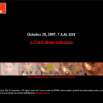
After 13 years, it was time to facelift the Lucire licensing website.
It’s a very familiar template, similar to what we used for JY&A Consulting a few months back. The home page copy we already had from a flier that we created late last year that Susan Ninan and I worked on; and the ‘About’ page’s text was mostly carried over (though it still needs 13 years of updates).
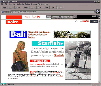
I am surprised the old site still netted us enquiries but it was looking extremely dated. The 2008 design was positively archæological in internet terms. However, I’m not sure if the new one is particularly interesting, because the web design convention is to do something very simple at the moment.
The old one was created with consideration for those who didn’t have mouse wheels, whereas these days it seems to be all right, even fashionable, to scroll away.
Hopefully everything is more fit for purpose though, and the links are more useful. We’ve kept the code very light.
And if you do want to license an international fashion magazine with an independent, authentic and engaged firm, you know where to come.
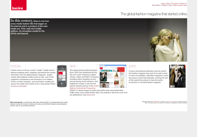
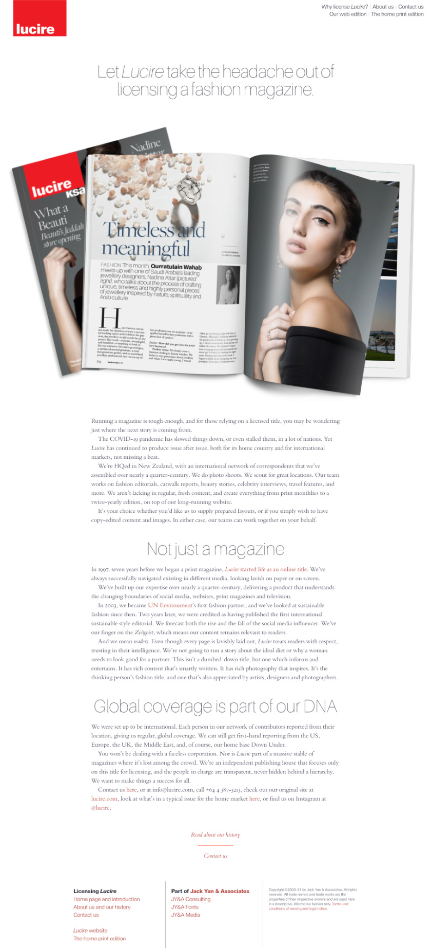
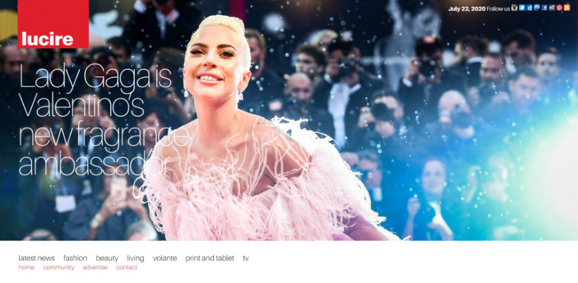
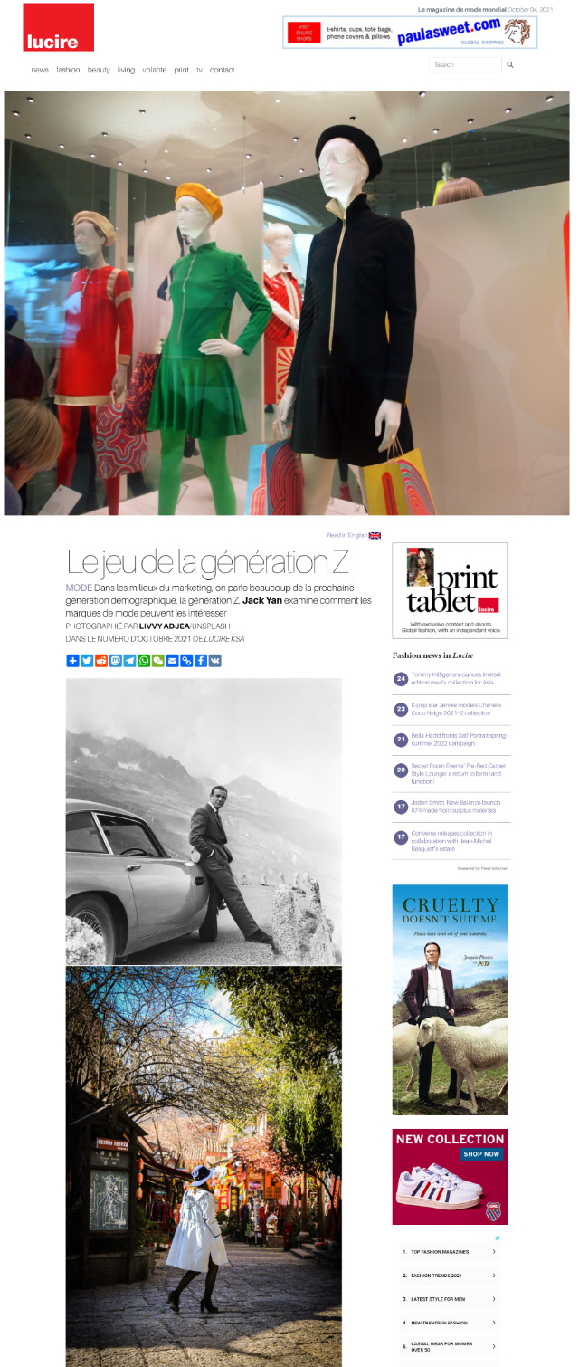
Above: The old and the new Lucire licensing sites—to my eyes, the old appears more creative, even in 2021.
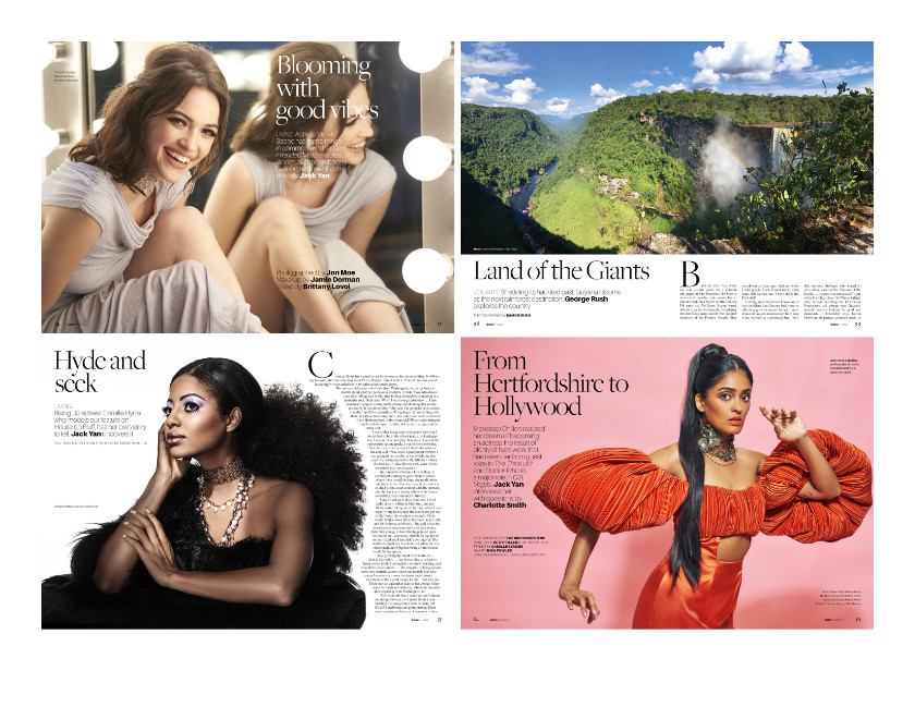
You may also like