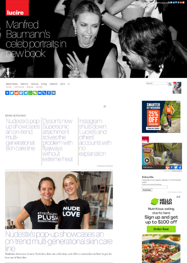
Those were two pretty intensive days but Lucire’s web edition now has a new template. Before you head over there excitedly expecting all change, it only exists on two pages so far, and they are of the same article but in different languages.
The look itself is not that different, either: we wanted to stick fairly close to what we had, but updated for the 2020s to handle mobile traffic.
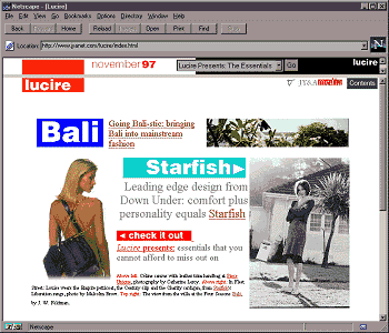
Surprisingly, the outgoing template was created in 2013 with some concessions to mobile devices, and was partially responsive, but as those of you who surfed to Lucire on mobile knew, it did not cater that well to them. One big issue was the use of HTML tables (the old-fashioned ones), which would play havoc on cellphone browsers unable to grasp at just what size type should be displayed at.
I kept hoping there would be technology that would straighten all of this out—there was in the 2000s with Bitstream having devised a solution to show reduced pages—but the pace of change isn’t as fast as you might think when it comes to web stuff. Of course not, when companies with monopoly powers dominate in the US, and affect a lot of the world.
That old template was tweaked briefly in 2015 (shifting the subsidiary column from the left to the right) and it is remarkable that something that old managed to keep us going all this time.
Over the weekend I began developing a cellphone-friendly template with a single-column layout. The trouble was that when I finished, I noticed it was utterly devoid of character. That was the trouble: I was designing more for the cellphone than the web, and the smaller medium doesn’t lend itself well to creativity.
For the first time in Lucire’s history, I opted to get an open-source template from HTML Codex as a starting-point rather than create it myself. The result is quite a departure from theirs, but the underlying code and stylesheet are theirs, and, rightly, their credit appears in the footer.
This first story also marks the second time a Lucire article has appeared in French online. It has been taken from the second French issue of Lucire KSA.
There are both up and down sides. The obvious up side is that the template works remarkably well on a desktop screen and on a phone, but not without some substantial tweaking (hence the hours put in). Unlike my single-column layout from the weekend, it still has character. For better or for worse, the result is based on one of my designs.
The big down side is that the stylesheet file is 180 kbyte in size, versus 17 kbyte with mine. Some of my CSS specs wound up in the big one. It also has to call a bunch of Javascripts, including one Jquery and a Bootstrap bundle. I will put parts of the page template into virtual files for the server-side includes to summon, but for now, with the hard coding, it’s about 10 kbyte larger than my effort.
Kudos to the original template developers, whose efforts have saved us a lot of time, and I look forward to tweaking things further as this new look becomes the norm.
You may also like


One thought on “After eight years, a new template for Lucire’s online edition”