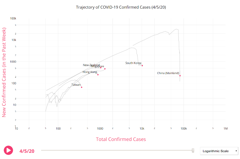
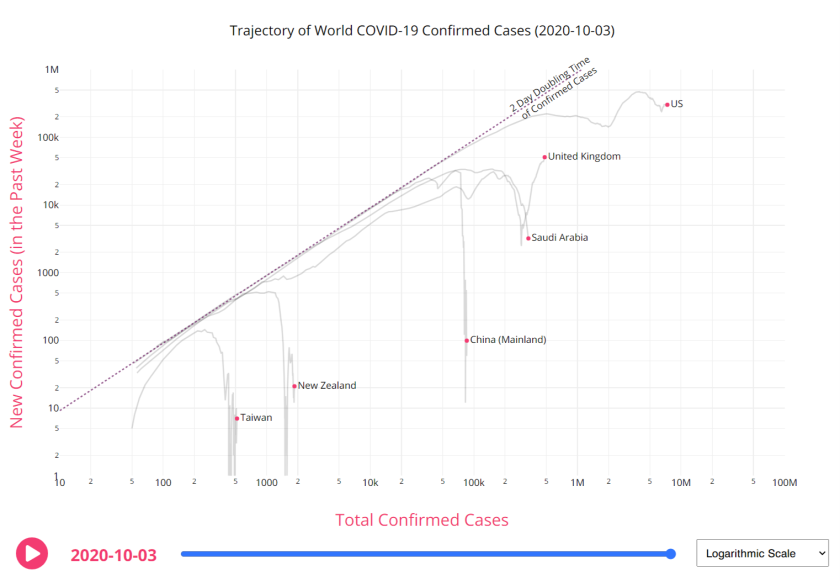
Russell Brown linked this COVID-19 trend page by Aatish Bhatia on his Twitter recently, and it’s another way to visualize the data. There are two axes: new confirmed cases (over the past week) on the y and total confirmed cases on the x. It’s very useful to see how countries are performing over time as it’s animated, and to get a handle on what trajectory you’re on.
I’ve plotted us against some Asian countries and territories in the first graph and western countries in the second. South Korea is doing quite well and Taiwan is really bending its curve down. Try it yourself by clicking on either of the screenshot graphs below.


