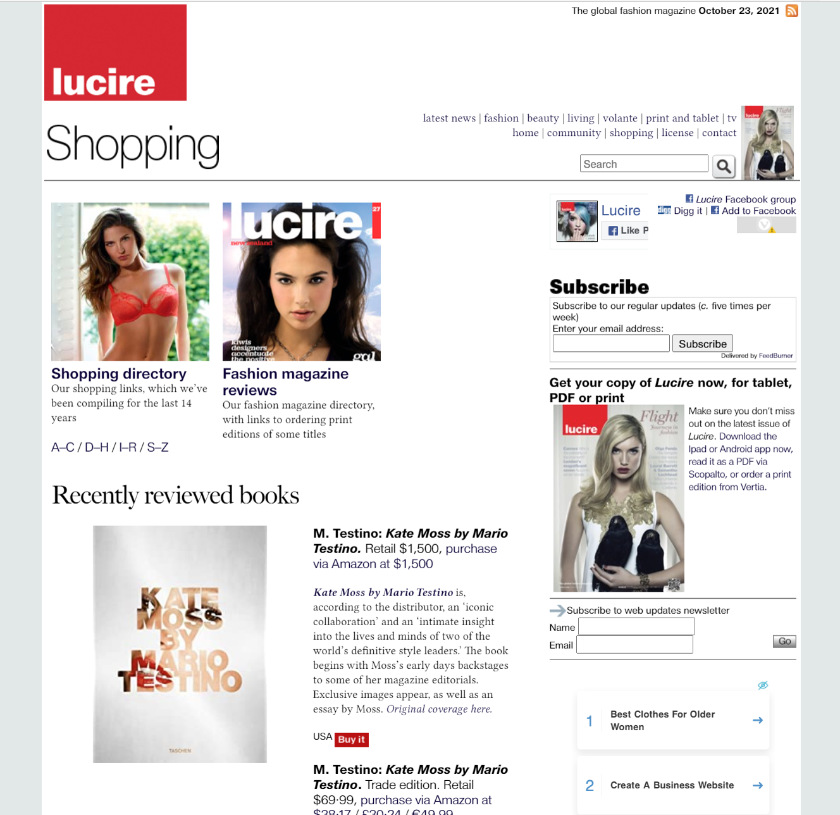
My friend Keith has been away from Facebook for six weeks, for work reasons, and hasn’t missed it. And he asked, ‘Was it all really a waste of time?’
I know you think you know what I’m going to say, but the answer might surprise you a little.
Fundamentally, it’s yes (this is how you know this blog has not been hijacked), but Keith’s question brought home to me, as well as other work I’ve done this week, the biggest con of Facebook for the creative person.
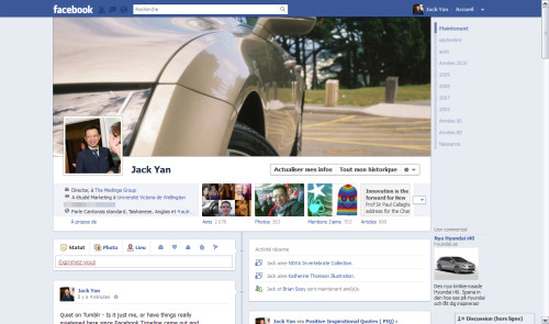
It’s not the fact the advertising results are not independently checked, or that there’s evidence that Facebook itself uses bots to boost likes to a page. The con was, certainly when I was a heavy user around the time Timeline was introduced, making us feel like we were doing something creative, satiating that part of our brain, when in fact we were making Zuckerberg rich.
How we would curate our lives! Show the best side of ourselves! Choose those big pictures to be two-column-wide Timeline posts! We looked at these screens like canvases to be manipulated and we enjoyed what they showed us.
Before Facebook became ‘the new Digg’ (as I have called it), and a site for misinformation, we were still keeping in touch with friends and having fun, and it seemed to be the cool thing to do as business went quiet in the wake of the GFC.
And I was conned. I was conned into thinking I was enjoying the photography and writing and editing—at least till I realized that importing my RSS feeds into Facebook gave people zero incentive to come to my sites.
This week, with redoing a few more pages on our websites, especially ones that dated back many years, I was reminded how that sort of creative endeavour gave me a buzz, and why many parts of our company websites used to look pretty flash.
The new look to some pages—the photo gallery was the most recent one to go under the knife—is slightly more generic (which is the blunt way to say contemporary), but the old one had dated tremendously and just wasn’t a pleasure to scroll down.
And while it still uses old-fashioned HTML tables (carried over from the old) it was enjoyable to do the design work.
There’s still more to do as the current look is rolled out to more pages.
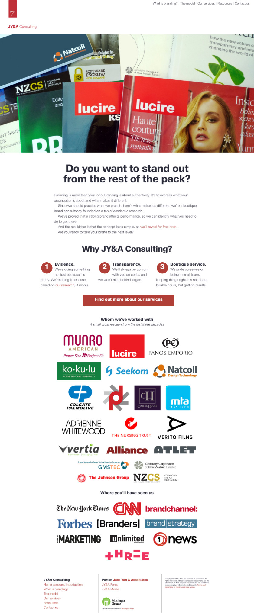
Maybe it took me a while to realize this, and others had already got there, but most of my time had been spent doing our print magazines lately. But designing web stuff was always fun, and I’m glad I got to find that buzz again, thanks to Amanda’s nudge and concepts for jya.co, the JY&A Consulting site. Forget the attention economy, because charity begins at the home page.
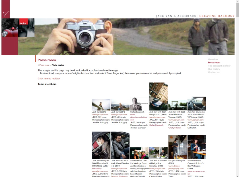
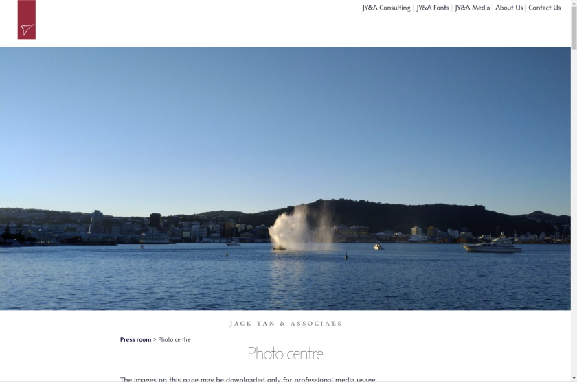
Photo galleries, old and new. The top layout is more creative design-wise than the lower one, but sadly the browsing experience felt dated.
