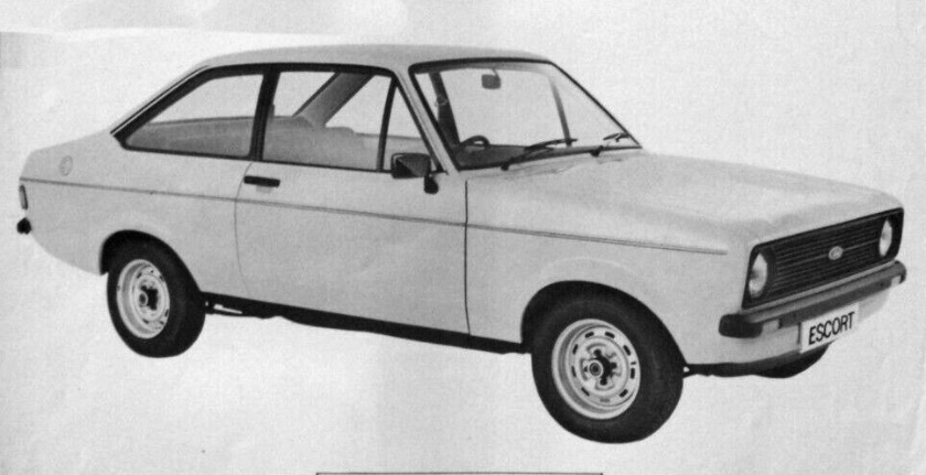
A seven-year-old needs to figure this out: what would the Ford Escort Popular Plus be priced at if were assembled in Aotearoa?
Amanda and I were chatting about prodigies. Some young people are amazing, doing uni classes at intermediate or high-school age, or playing piano like Mozart, and while not all of us have genius-level genes or brains, many of us are blessed to have followed our dreams. I count myself as one of the lucky ones.
I’ve told the story about my interest in typefaces from a young age in interviews, and how not having The Lettering Book in 1979 (I knew NZ$5 would be a stretch for my parents, so I didn’t bother asking) actually helped me create, in my head, a memory for typeface shapes.
Rewind a year and a bit. I recalled as a five-year-old being interested in car price lists, both here and the UK. I memorized them. I figured out how much an Escort Popular might cost here if it were to be made available by Ford New Zealand. When I was seven, there was a Saturday morning show, Leycar Cost-a Car, on 2ZB, one of the local commercial radio networks in Wellington, where people wishing to sell their used car could call in and have a professional valuer tell them what it was worth. I would race the man, get to my figure first, and he and I would usually come to the same amount. When my godfather told me about exchange rates, that was another level of fun.
It was a blessing to not have every bit of information at my fingertips because when I got it, I cherished it. Borrowed copies of Motor from the library, for instance, and I’d ask my father to photocopy the price lists—a boy needs to know the effect of inflation during the Winter of Discontent. Car magazines gifted by my friend Laura Hayvice’s father, Gary, when he had finished reading them. The Auto Katalog for 1979 from Karl Urban’s dad Jürgen.
My car reading secure, with extra copies through pocket money (thank you, Mum and Dad), I kept pursuing my typographic knowledge. By the time I was 17, I knew every typeface available in Wellington, and which typesetter had what. I knew who had Compugraphics, who had a Varityper, and who had Linotypes. I knew roughly who was cheapest out of all of them, so if there was a job that needed Helvetica, and there were no italics, I knew who had reasonable Helvetica clones but never bought the italic (relying on obliques) so I could get the job set there.
My point is, while I couldn’t do scientific research to find an enzyme to solve a health issue when I was 11, I was allowed to indulge in my passions and that really, really helped me as an adult.
I was extremely fortunate to have supportive parents, who had both gone from employment to self-employment, who encouraged me to find my own niche. That direction left undisturbed turned into, I hope, good things overall: new typeface designs that I developed from scratch, originally bitmaps for the Commodore 64 when I was 13 to “real” vector fonts for Mac and PC by the time I was 20, and that was after five years working commercially, after school, as a hand-letterer—these were the designs that formed those first releases I did myself. (ITC and Monotype, thank you for rejecting me when I sent earlier stuff to you. I held on to all the rights.) You can see how Autocade came out of these youthful passions, too, even if it took 43½ years between Gary’s first Modern Motor (June 1980 issue) and the first Autocade Yearbook. I got there.
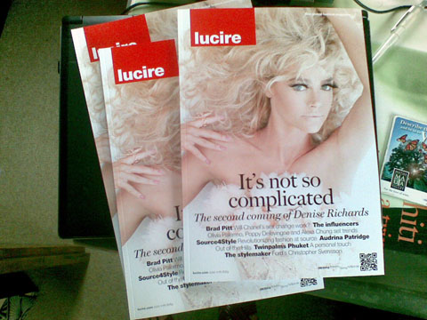
And that same journey into typography led to Lucire. In 1989, I picked up a copy of Studio Collections because I liked the typography. Being a straight boy seeing pictures of women wasn’t exactly a chore, either. This beautiful magazine went from stunning traditional typesetting (laser typesetting on high-end Linotype machines) to ghastly desktop publishing by 1991 with some horrid typographic treatments—but it held my interest as I observed the technological change and decided I could not be for it, if the results were sub-par. Advance, by all means, but don’t make me notice it. Don’t compromise on what good typography is for the sake of technology.
Here you see the genesis of why US colleagues told Women’s Wear Daily in 2004 that they thought Lucire’s website looked like a print magazine. And herein lies the genesis of Lucire itself: the challenge to art-direct a fashion magazine well, balancing imagery, journalism, layout and typography. I started online because the medium captivated me and because it had never been done before in this country (Fashionbrat aside at Wellington Polytechnic, and that was experimental, in a single issue). I spent a year in 1996 planning it, at the same time Wellington Polytechnic was making theirs. Lucire’s foray into print in 2004 was similarly motivated to fulfil my own passions: though looking back it was nice to have been a pioneer (or the pioneer?) in taking a web magazine into print.
To any young person reading this now: if you have a passion that others might feel are left-field, I say run with it, if it’s legit and not harmful. God knows we need this creative energy to drive the next generation of innovation, because it sure as heck isn’t going to come from Big Tech firms. And parents, if your child or children have those interests, encourage them, let them take them as far as they can. They’ll be happy pursuing them and you never know if their ideas could turn into something that the world wants. Don’t put people into boxes: society does enough of that, forcing humans into drone mode with shoulds and don’ts.
Half a century into this lifetime, I can see where my passions have got me, and we wouldn’t have Lucire or Autocade or a few hundred extra typefaces (of varying quality once you include the early stuff!) without the encouragement and support of my maternal grandmother and my parents, and now, the encouragement and support of my partner.
You may also like