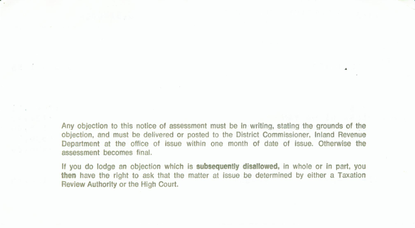
This was the back of Mum’s 1985 tax assessment slip from the IRD. Helvetica, in metal. The bold looks a bit narrow: a condensed cut, or just a compromised version because of the machinery used?
Not often seen, since by this time phototypesetting was the norm, though one reason Car magazine was a good read was its use of metal typesetting until very late in the game. I know there are many reasons the more modern forms of typesetting are superior, least of all fidelity to the designed forms, but there’s a literal depth to this that makes me nostalgic.
You may also like