I haven’t been able to find anything on this bug online, but it’s very common.
As far as I can recall, all of our online publications that use Wordpress have themes designed or modified by yours truly. However, Lucire Rouge has a mostly bought-in theme, where my changes have been limited to a couple of CSS rules. The theme developer actually came in and helped us with a few modifications, which shows the extent to which he does follow-up for paying customers.
But there was one thing he was never able to crack, and I don’t think it’s his fault, since it happens on a lot of websites, including Medinge Group’s (also a theme I did not design, though I did earlier ones). On both these sites, there were no bolds and italics. There still aren’t on Medinge’s.
There are <strong> and <em> codes in there, but the bolding and obliquing are done by the browser. The font files actually aren’t loaded, so what we see are false bolds (the browser attempts to “overprint” the roman, duplicating the outline and shifting it marginally to give the illusion of a heavier typeface) and obliques, not italics (it’s the roman file pushed over 15 degrees or so). The former is particularly bad, as the outlines clash, and the result can be hollow glyphs, something that any font developer will know when one outline winds up accidentally on top of another in Fontographer or Fontlab.
These Wordpress themes rely on Google Fonts (another sin, in my opinion) so I don’t know if the fault lies with Google or Wordpress, or the developer. If Wordpress does indeed power 70 per cent of websites, then I have to say the bug is awfully common, and I probably do see it on a very high percentage of visited sites.
The themes allow us to select the font family, but the selection only calls a single font file from the family.

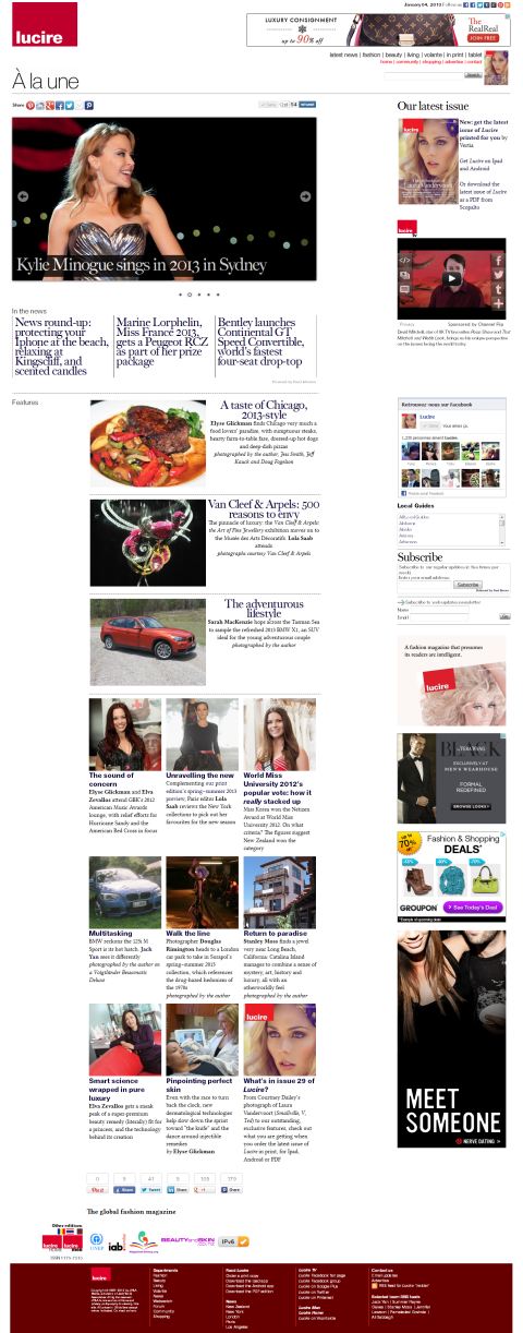
Above: A graphic clipping text from Lucire Rouge that I sent to the developer.
The solution, as I discovered after months of toing and froing with Lucire Rouge’s theme dev, was to do your own font-linking rules in the CSS file and upload the fonts themselves to the relevant directory on the server. I must note publicly the ‘months’ were not his fault, but due to my own delay. I should not expect computer programmers to be typographers, either.
It is something that one needs to watch out for, as the fake bolds and italics are horrible to look at, and must look amateur, even to the non-professional.


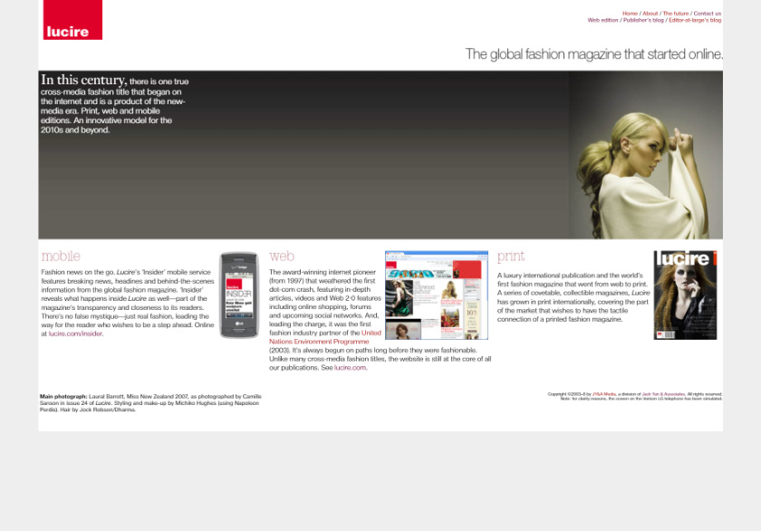
Above: Fixed at last by yours truly.

