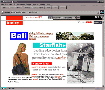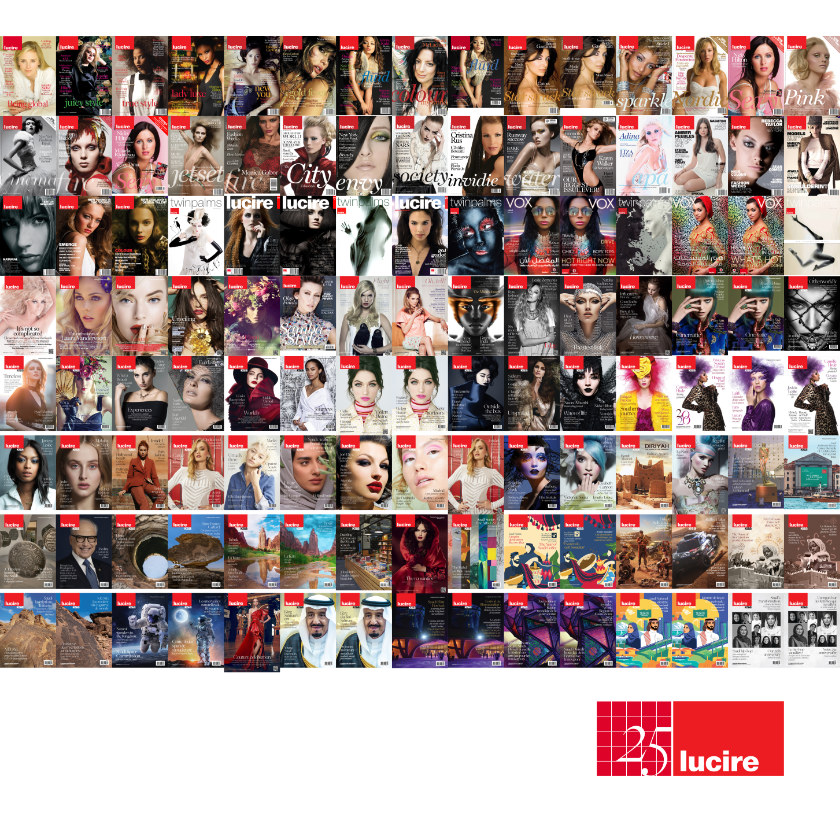

We’ve made a tiny change to the look of the Lucire website, replacing Aileron Ultra Light in the headlines with Newsreader Display Light, namely the 72 pt cut. It always bothered me that Aileron didn’t have proper italics, only obliques. We could have licensed Freight Big Pro Light to match the print magazines, but Newsreader does look quite contemporary and works well enough. (After all, the Bembo body type doesn’t match the ITC Galliard used in print. For much of their history, the different editions had their own paths and looks.)
It reminds me a little of Janson Text and it’s curious that the J doesn’t have an descender given its total width. I haven’t read up about its provenance yet, which is a little unlike me.
It’s not in advance of a new template, as we’re busy rebuilding another site within the company. More soon.
