Long before Mad Men, and before I got into branding in a big way, I had an interest in advertising. One of the greatest send-ups of the industry was the 1990 Dudley Moore starrer Crazy People, set in the advertising industry against a politically incorrect—actually, cruel and inaccurate—look at mental health. It’s one of those films that could never be made today, and for good reason. But there are some gems in it, as Moore’s character, Emory Leeson, embarks on “honest advertising”. It gets him committed to a facility—who ever heard of an advertising agency telling the truth, right?—until his ads become a hit, welcome by consumers who don’t want BS.
I came across this wonderfully copywritten and set ad from a PR professional in London trying to sell his Nan’s 1981 Volvo 244DL:
My Nan is selling her old Volvo, so here's an old style Volvo ad from me to help her sell it. @volvocars @VolvoCarUK #volvoownersclub #volvoowners #vintagecars #vintageads #volvo244 pic.twitter.com/yflAX1Ozq1
— Paul (@PRPearson) February 6, 2018
It’s bloody good. The copy kept me engaged—like all good ads used to—and he’s done a reasonably good job with the Volvo Broad headline typeface (it was wider back in the day). The body text type should be Times rather than Baskerville, but considering the exact cut of Times isn’t available digitally (to my knowledge; it’s for larger text, and has very short descenders), there’s no wonder he opted to use another family.
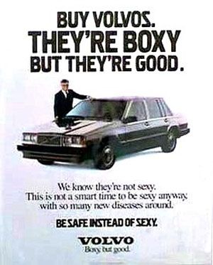
It got me thinking: I’ve often posted the Crazy People Volvo ad in comments, as a humorous response. However, the ad doesn’t exist in a decent res online. The only ones that have wound up online are from screen captures from the movie. This 22 kbyte file is actually the best one around, save for one on the Alamy stock photo website that I found after the fact:

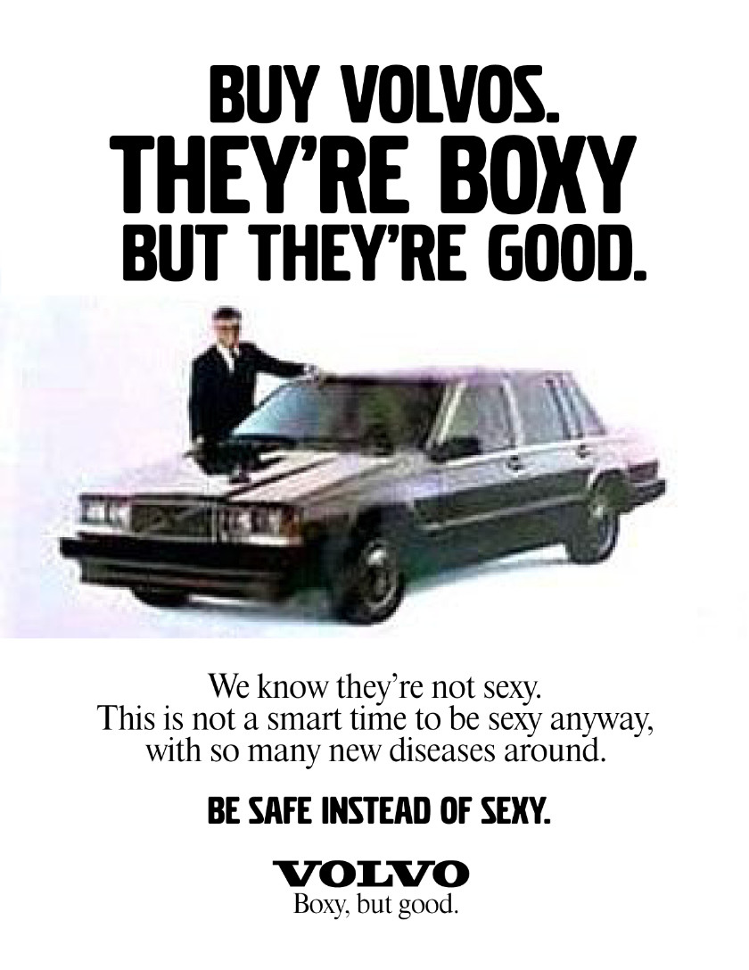
I couldn’t re-create the image—I assume the only person who has it (or had it) is the art director of the film, or the photographer that was commissioned—but maybe I could have a go at the type?
The digital Volvo Broad had to be widened 25 per cent, and I didn’t attempt to match the kerning.
The body type was the interesting one. I opted for Times Headline, since it wasn’t at a text size, but as I discovered, Volvo used a particular cut that had short descenders and was slightly condensed. I tried to match the leading.
Therefore, here it is, offered under Creative Commons with attribution to me for the typesetting, please, while noting the image is not mine:

And sometimes, I use my powers for good.


