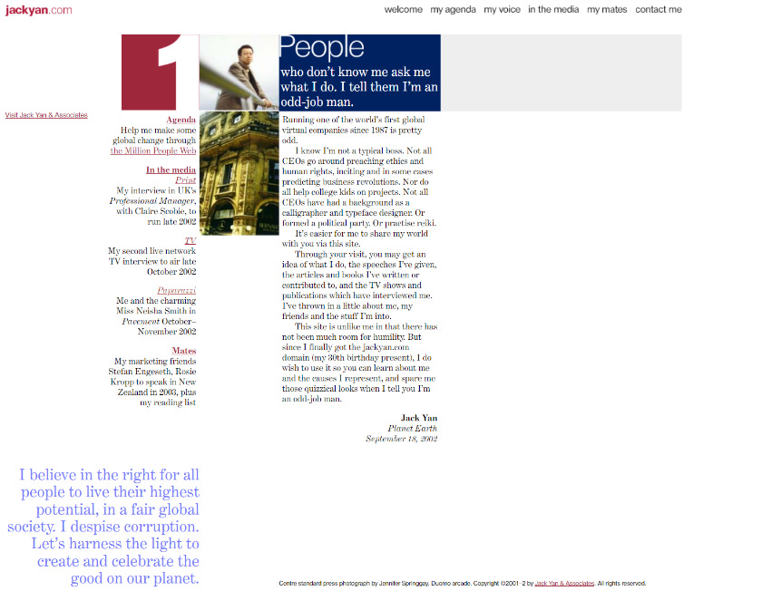
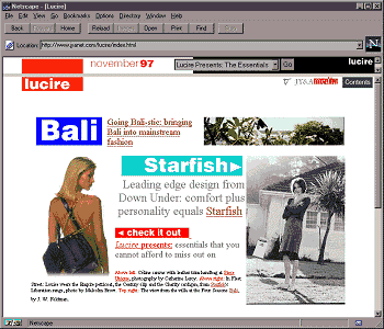
When I said this was the third template for this site yesterday, I was wrong. There was one more at the very start, thanks to the Wayback Machine at the Internet Archive, making 2023’s new look the fourth. In September 2002, very soon after I acquired the jackyan.com domain around the time of my 30th birthday, it looked like this:
It looks pretty darned good, if I say so myself. Looking through my own files, it appears I got rid of this layout in two short months, in favour of this, which lasted till 2013.
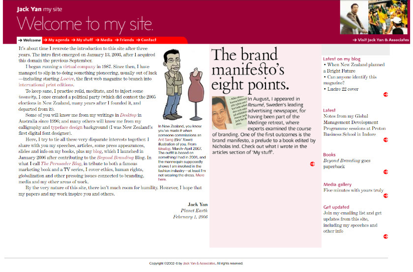
All I can say is that it must have seemed trendier in 2002. Above is a later version with the Ant Sang illustration of me, which he kindly gave me permission to use (it originally appeared in Idealog in 2007). But through the eyes of 2023, the original layout appears fresher. Back in the day when we didn’t have to design for cellphones and let good old, lean HTML do its thing. No Javascript, just plain old mark-up language, building the look that you had imagined.
If you really want to split hairs, this is the fifth look. I didn’t always own this domain. Someone called S. Jack Yan had it and posted photos of fishing boats where he lived in Taiwan. I offered to buy it and he declined. Then he let it expire, so I picked it up for US$75 (I had a service monitor when the domain became available, hence the high price, even by 2002 standards). The Wayback Machine has no record of the original site, which is a bit unfortunate.
I am still undecided whether to restore the previous post–next post links at the top of each entry. One appears at the very bottom now. Your thoughts are welcome. Did you ever use them?
You may also like


“All I can say is that it must have seemed trendier in 2002.” Hahahaha… I know this feeling. I think our blogs deserve a fresh look every few years. I like my current one, but I sometimes wonder if it’s already “dated”. Do I care? Not really – not until I look at it, one day, and hear that voice in my head saying, “WTF were you thinking?” That’s my cue to rip it all up and start over. I’ve never really been one to follow trends, so why start now? As long as the friends who visit keep visiting and aren’t complaining, and I still like it, I’m keeping it as is!
Yours looks fine on mobile and desktop, whereas mine looked terrible on mobile. The mobile skin was so bad that I opted for desktop mode even when on a phone, so I didn’t have to look at it!
This one isn’t too “trendy” but I like the fact it plain works, and has the same look across devices.
I think the 2013 redesign here was just for political purposes: I wanted the site and the election materials to match. Hence I had the extra-bold typeface for my name—always good for an election!
For the old skin, I did receive complaints, or at least friendly advice from people who saw the <em> tags whenever I had italics in the title and they were browsing on their phones. It annoyed me, too. Interestingly, Mitch Mitchell uses the same WP Touch mobile skin I formerly did and he’s been AOK, but for me, the italic codes literally appeared!
I put up with it for years longer than I should … which is why I’m so very grateful I managed to get it sorted at long last!
I’ve had to revamp my business website over the years, as I just hit my 21st year. I had to learn a lot because my first website had different colors for every page… which I thought at the time was really cool. lol Then I had to recode it so it would be mobile friendly, and later paid someone to help me create the menus for the site, which I learned how to do because of his help. Gotta do what we’ve got to do, right?
I had different colours at one point for my consulting business—I still think having different colours is cool! You can see it in the Wayback Machine here—the big block changed colour on each page. I still haven’t redone all of mine for mobiles since I’m not a big user of them—taking me a long time to come round to the notion that the majority browse on those tiny devices, but you’re right, we got to do what we’ve got to do! (And as we can afford it!)
Your menu’s really neat!