After my endless complaints about Firefox crashing on Twitter (even with a fresh install, it still crashes multiple times daily—even on the machine where the hard drive was reformatted), I was pointed to Opera 10·63.
I can tell it’s not really designed for anyone who likes type. Here’s how my Twitter page looked, with the default settings:
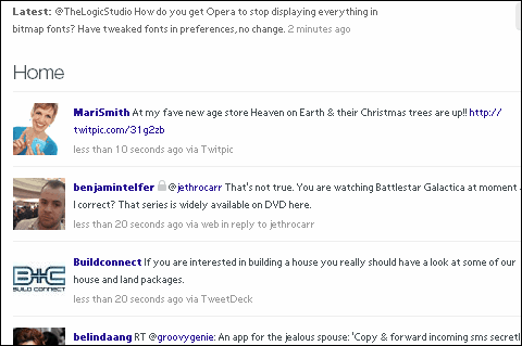
In case you think your eyes are deceiving you, those are, indeed, bitmap fonts. Actual size.
Here’s a page from Twitpic:
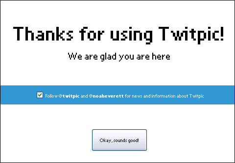
On our computers, where Arial is absent, Opera defaults to System. It ignores whatever you feed into the font preferences until you start tweaking the CSS under opera:config. This is ridiculous. Since we have FontSubstitutes fed in to the Windows registry to indicate how Arial should be substituted, and every other program we have understands this, it seems silly for Opera to stand alone—and to substitute to one of the least likely fonts as a new default.
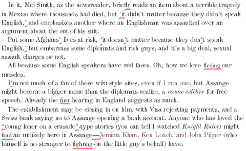
But say you have Arial, or any other typeface, installed. Opera still has a problem. It cannot display quotation marks in the specified typeface. This, to me, is ridiculous: if IE5 and Netscape Navigator 4·7 can, then Opera 10 should be able to do that. Here’s an enlargement from Khoi Vinh’s Subtraction blog:
It’s meant to be set in Helvetica. It is—except for the quotation marks.
However, I can’t dis Opera too much because Firefox 1 and 2 had this rather serious omission, something I complained about at the time. It was only Firefox 3 that someone decided that displaying punctuation in the same font as everything else might not be a bad idea.
It also does something funny to any word with an fi or fl ligature: it changes the font for that word. Nothing else, just that one word.
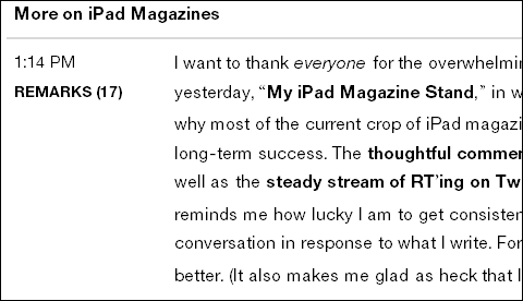
On Firefox 2, it would display only the ligature in another typeface. This was my test in 2006:

Here’s what Opera does, with the affected words highlighted:
Weird? You’re telling me, especially as the typeface appears to be Garamond Light—something I only specified for the H1-tagged headlines as a default. Believe me, there are no H1 codes on the page.
I guess with the smaller user base, there have been fewer bug reports filed about these issues. I have filed one on the default fonts, and will be doing another on the remainder.
The good news is that Opera doesn’t seem to crash quite as often. It also seems more compatible with Flash: my father, who browses news sites a lot, says he has far fewer problems with video buffering, even on an older machine. And I prefer the look of the browser—Google Chrome has really changed the æsthetics of how we expect browsers to look.
So if you can live with the alleged weaker security and the poor typography, Opera seems to be a good browser. However, I can’t live with poor typography, so I might only use the browser as a back-up.
In summary, in my world:
- Firefox: crashes all the time;
- IE8: cumbersome;
- Opera: bad typography;
- Chromium: interprets some code oddly;
- Chrome: made by Google, and 2010 is my year of being Google-sceptic.
I use Safari on the Mac, but we’ll leave that to another blog post.
You may also like


Because I’m just a geek:
So how does this apply to Linux?