One thing that marketing teaches you is that you need to have a market orientation: put yourselves in the shoes of the consumer and figure out what they want, rather than force something on them.
And one thing that leadership teaches you is owning up to when you’ve got it wrong, and making the necessary changes.
Today we welcome JYA Creative, which succeeds JY&A Consulting.
It’s our own rebrand, making it clear just what we do.
An earlier blog post indicated a shift in the language from branding to identity, and for us, we needed this latest change, because no one actually knew what we consulted in.
When we first began using the JY&A Consulting business name, it actually made a lot of sense—for the simple reason that people kept hiring us. And that could be to do with a number of things: the press coverage we were netting, the visibility we had on the search engines, the fact that this was taking place pre-social media.
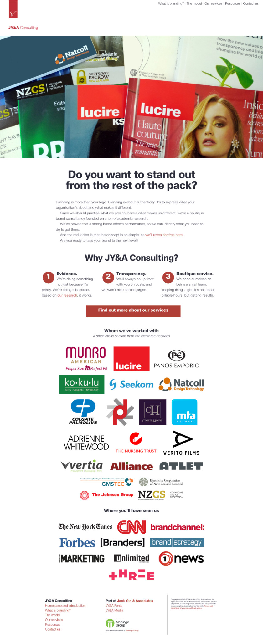
While we adapted to each new thing that came along, the junk that plagues the internet worsened, and that definitely had an impact on us. And the market shifted. The 2021 redesign of our website probably didn’t help, either: while it explained in very plain language what we did, it really wasn’t hitting our market properly. We weren’t showing off all our work and left it too much to the audience to figure that out. We had to do better.
The name had to go for a start, because of its vagueness. Then when I paired it alongside our existing symbol, it just didn’t work.
The ampersand also disappeared for the sake of branding: it made sense for JYA Creative to match the jya.co domain name that we owned.
The three-stroke symbol isn’t gone altogether: it’s still on other parts of the business. It dates back to an economics lecture in 1991. I doodled a lot during Econ 101 since the subject bored me with its theory and lack of real-world examples. I must have drawn many different ones, but the definitive one had a nice flair to it, at least to my 19-year-old eyes. It can’t have measured any more than an inch wide, but thanks to a photocopier, and retracing, I wound up with a pretty sharp version of it.
It was never going to be run big anyway, so I didn’t mind the imperfections. It looked like a few letter Js shaped into the form of a Y moving upward. At certain angles it could look like something else. (When some American trying to harass me via fax in the early 2000s pointed it out, meaning it to be an insult, I thought, ‘Dude, you’re well behind: we’ve already joked about it.’)
In 1996, my friend Ingrid Kennedy gave it a makeover with new colours and we’ve had versions of that ever since.

With the web, not many people understood one-stop shops back in the 1990s, so we began promoting ourselves as JY&A Consulting, JY&A Imaging and JY&A Media, each doing their own thing.
As the businesses grew, they stuck to their specialist areas. However, going forward I’d like to think of JYA Creative as our for-profit, charge-out arm, JY&A Fonts continues to publish fonts for retail sale, and JY&A Media publishes and licenses Lucire and Autocade, and anything else we might add to our portfolio.
Today, we start a new journey with a refreshed team at JYA Creative, with familiar faces and two new ones who I’ve worked with in other capacities since the turn of the century.
The new symbol represents the six of us, though of course there are plenty more colleagues that we call upon regularly as jobs require. It also represents creativity, the circular nature of life, and the love of letterforms. It’s also the letter y times six. We’ll see about rolling it out to other parts of the business and make our best judgement on what sort of brand equity the old one has after 32 years.
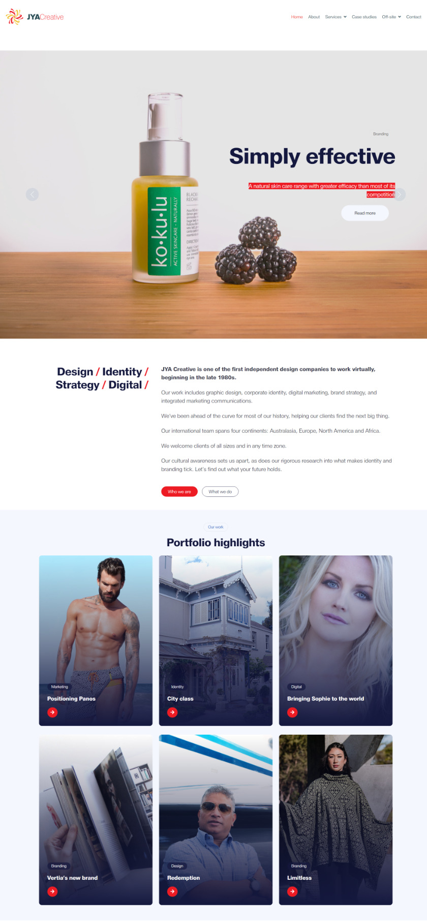
The new site shows off more of our work, although (somewhat annoyingly) some of the most complex and in-depth jobs wound up having only a short description and a few images. We can’t breach any confidences, so we can’t provide the full stories, and I don’t want to reveal too much of our internal process. I’d love to get a few more pre-digital things up there, too, as they emerge from the boxes of archives.
It’s market orientation: presenting what we do in a way that everyone understands. We’ve kept the copy simple. Everything is Bootstrap-based and hand-coded by yours truly, other than the underlying template (which we’ve heavily modified). However, we’ve also anticipated a few shifts in the market in the near future, which hopefully we’ve accommodated. You still need to future-gaze in this line of work.
There’s over 35 years’ history here, and I hope we’ll have decades’ more work to come that we can all be proud of. Your feedback about the new site is very welcome.
The old
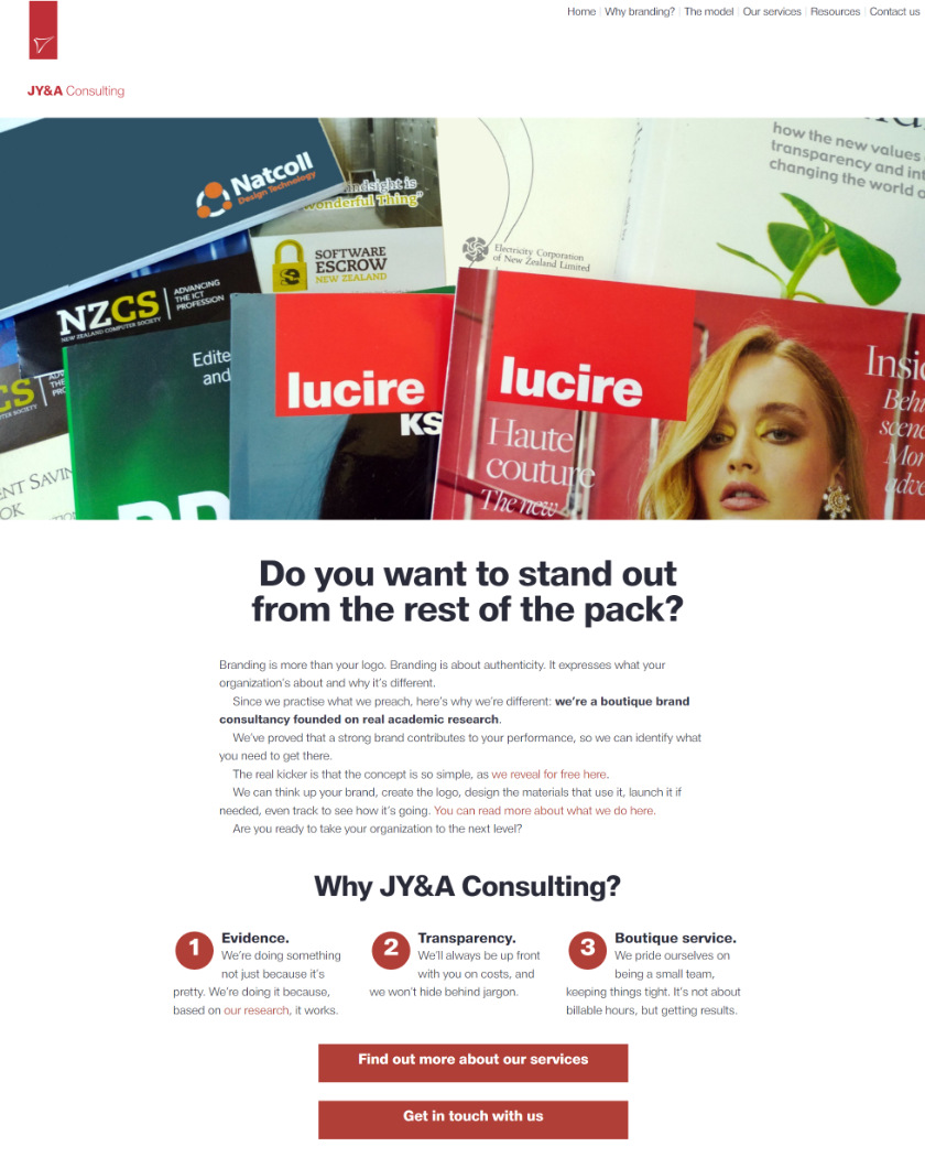
The new
The deadly
Those of you who follow The Persuaders will get the joke here.
You may also like